

Robert Indiana
Some of Robert Indiana’s earliest surviving artworks are drawings dating back to 1945, when he was 17. They ape the style of Reginald Marsh, who painted gritty, gaudy, sleazy, open-24-hours America, the America of movie houses festooned with advertisements, of shop window mannequins and carnival midways and burlesque shows, the America of bustling neon streets in the shadows of elevated train tracks at night.
A decade later, as you can see in the survey exhibition “Robert Indiana and the Star of Hope” at the Farnsworth Art Museum in Rockland, Maine, Indiana would turn to African tribal sculptures and traditional Asian banners for inspiration – sources Europeans had drawn from when they invented Modern art. But by the end of the 1950s, he was looking at America again, to roadside advertisements and pinball machines, and, later, the symbols of fraternal halls like the Star of the Sea Oddfellows Lodge on Maine’s Vinalhaven Island, in which he has lived since the 1970s. He seemed to recognize these vernacular graphics, the iconography of Marsh’s America, as an American folk art, as commercial and practical and rough and tumble as the people themselves. And they would become the jumping off point for all that followed.
Indiana, who is famous for his “LOVE” logo, has called himself “an American painter of signs.” The statement is often interpreted as a self-deprecating comment about his art. But it likely has a double meaning describing Indiana’s love of speaking in code, in signs. His symbols are generally autobiographical, or encrypted emblems of a gay man painting in straight America. An example: his frequent use of the word “eat,” Indiana has said, refers to his dying mother’s last words, asking if he’d had something to eat.
The transition from his early crusty paintings of elongated heads, with echoes of African sculpture and Byzantine icons, to his signature Pop Art signs is a group of flat abstract works from 1959. These "Source" paintings feature black seed shapes nested in green or brown saddles. The flat, abstract compositions evidence the influence of – or at least kindred thinking with – his friend, and reportedly then lover, Ellsworth Kelly.
With that addition of hard-edge abstraction, all of the formal components needed to invent Robert Indiana were in place. It’s no coincidence that around this time he dropped the last name he was born with, Clark, in favor of a new name honoring his native state.
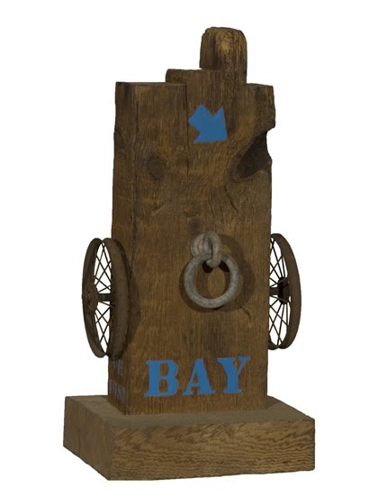
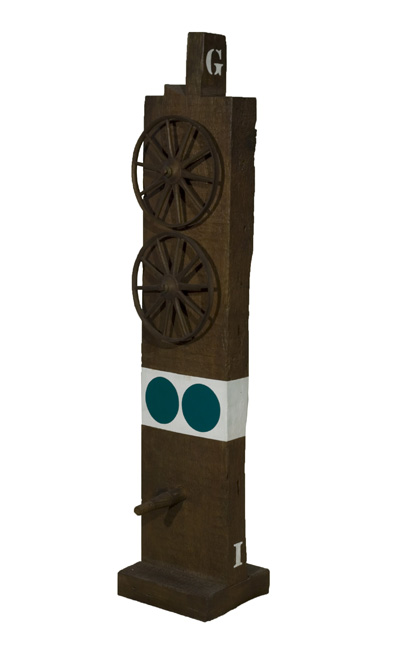 By 1960, Indiana was constructing sculptures from wood beams and charismatic junk that he scavenged among the old buildings and crumbling piers near his studio in lower Manhattan. (Unfortunately, they’re mainly represented here by bronze reproductions from 1991.) He mounted the beams upright and attached rusty wheels along the sides. He painted them with circles and triangles like stoplights, and stenciled on numbers and words (“orb,” “eat”). Formally, the sculptures sit somewhere between Modernist assemblage and backroads folk sculpture, with hard-edge abstraction masquerading as street signs. They register as strange weathered holy totems of roadside America.
Indiana called them “Herms,” after ancient Greek and Roman road markers, usually topped by the head of the messenger god Hermes and featuring a phallus. Mr. Indiana’s version is similarly gendered, frequently with a stiff wooden peg projecting from the front.
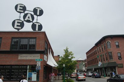
His 1964 sculpture “Electronic EAT” (the indoors one, not the one atop the museum) is a black metal circle behind white capital block letters, filled with flashing white lightbulbs, that spell out the title. The lights jitterbug in alternating patterns. Minimalist simplicity that generates megawatt effects is the hallmark of Indiana’s crackerjack graphic design. And always his primary strength. When he tries to get realist in paintings of his parents or Marilyn Monroe the results are stiff, awkward. Maybe we should call it crackerjack compositional skills for those who still rank graphic design beneath “fine” art. Whatever you call it, Indiana magics the commercial into a transcendent experience.
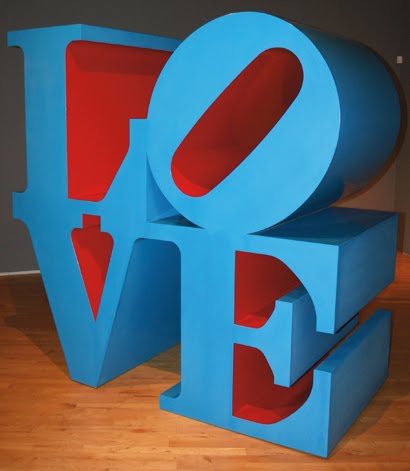
If you need additional evidence of Indiana’s design chops, here’s “LOVE,” which originated as a 1965 Christmas card for New York’s Museum of Modern Art. (An original is displayed here). One gallery is wall to wall with “Love” prints and painted bronzes, in English and Hebrew and Chinese. The idealistic emblem spawned a 1973 postage stamp and an industry of unauthorized knockoffs, becoming as ubiquitous as the yellow smiley face (c. 1963) or Milton Glaser’s “I (heart) NY” (1975). It’s so familiar that it’s impossible to see it afresh. “LOVE” is like a catchy, old top 40 hit – you wish you could get the schmaltzy hippy dippy chorus out of your head.
“LOVE” caps the most exciting moment in Indiana’s career. Some of the fizz is lost here as the show is drawn almost completely from Indiana’s own collection, leaving notable absences – like paintings riffing on gas meters and pinball machines. After this, he would mostly repeat himself with ever reduced returns. His “Hope” painting, a text piece that borrows the signature slanted “O” from his “Love” paintings, was commissioned for Barack Obama’s campaign last year, though he had been exploring the motif previously. It feels phoned-in, a knock off of his own work that – at least in this context – seems to lamely ride the coattails of Shepard Fairey’s iconic Obama “Hope” screenprints.
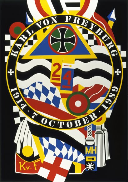 An exception is Indiana’s “Hartley Elegy Series” from 1990, which remixes Marsden Hartley’s 1914 and 1915 paintings memorializing a male German friend – likely a lover – killed during World War I. Indiana took on the series as a sort of sign of spiritual kinship with another Maine artist – and it makes apparent gay themes hinted at by the wood rods on his “Herms.” Hartley’s originals stack military flags, badges and gear in scrubby paintings about painting. Indiana cleans up and streamlines Hartley’s compositions. Here we mainly have to settle for screenprints, not Indiana’s original paintings. They're like dark festival posters, more vivid and dashing than Hartley, but without his soul.
“Robert Indiana and the Star of Hope,” Farnsworth Art Museum, 16 Museum Street, Rockland, Maine, June 20 to Oct. 25, 2009.
Pictured from top to bottom: Robert Indiana, “Electric EAT,” 1960s; “Ge,” 1960/1991; “Love,” 1996; “KvF I (from the Hartley Elegies: The Berlin Series),” 1990; “HOPE,” 2008; “Bay,” 1981; “The Descent of a Love Goddess (Diamond),” 2000; “Afghanistan,” 2001; “Diamond Ping,” 2003.


posted by Greg Cook at 4:44 AM
![]()

0 Comments:
Post a Comment
<< Home