Milwaukee

In November, I visited the Milwaukee Art Museum to examine its Santiago Calatrava-designed addition, which opened in 2001, and see how it compared to Boston’s new ICA. The Milwaukee building is a bright, airy space, a cross between a cruise ship and “2001: A Space Odyssey.” It feels like the future circa 1968. It’s charming, goofy, fun.
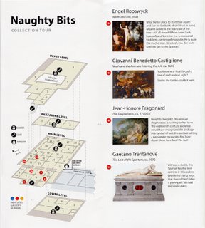 Another great thing about the museum – an idea other museums (ICA? MFA?) should steal – was a series of free pamphlet guides to the institution. The “Naughty Bits” collection tour directs visitors to art featuring, well, naughty bits. Introducing a 1605 painting of “Adam and Eve” it says: “What a better place to start than Adam and Eve on the brink of sin? … Look how soft and feminine Eve is compared to Adam – so tan and muscular. He is quite the macho man. Nice tush, too.”
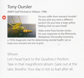 The “You Think You’re Having a Bad Day” tour recommends Roy Lichtenstein’s 1964 “Crying Girl,” an Audubon painting of an otter caught in a trap, and one of Tony Oursler’s signature talking dolls pinned under an overturned folding chair. “Seeing how tough these folks had it,” the guide explains, “might just make you feel better.”
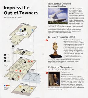 The “I’m in a Hurry!” guide suggests a quick dash through collection highlights for the busy visitor. “Impress the Out-of-Towners” directs you to a painting featuring the first reference to Louis XIV of France, a gold Tiffany tea service and a major Caillebotte painting of men boating. One guide lists the favorite artworks of Milwaukee Brewers ballplayers – mostly predictably conservative realistic stuff, except for infielder J.J. Hardy’s pick: an untitled boxy steel and Plexiglas sculpture by Donald Judd.
These pamphlets are evidence of a museum smart and confident enough to have a sense of humor about itself. But these aren’t just jokes. These guides engage people with the collection, informing and entertaining, by acknowledging the range of the audience’s interests.




0 Comments:
Post a Comment
<< Home