Michael Mazur
Boston’s Museum of Fine Arts offers a quickie survey of Cambridge artist Michael Mazur, presenting 25 prints from a collection of nearly 400 prints spanning five decades that he donated to the museum in December 2005. The 71-year-old is a big shot in Boston art, known for his technical experimentation, particularly with monotype prints, but looking at this show it’s hard to see what the fuss is about.
 Here are the trapped, haunted wraiths of his “Closed Ward” and “Locked Ward” etchings and lithographs from 1963 to ’65, with which he first gained notice. They were based on his experiences as a volunteer art therapist in a mental institution. They emulate Goya and German Expressionism, and come across as overwrought, trying too earnestly to be moody and expressionistic.
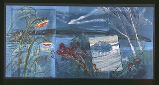
There are fussy realist works from the ‘70s that recall the stuff David Hockney and New Yorker cover artists were doing then, a moody 1985 drypoint self-portrait, and figure studies from the ‘90s. His 1984 triptych “Wakeby Night” (above) is a schmaltzily pretty panorama of birches and sunflowers lined up at the sea edge, inspired by his memories of summers at Wakeby Lake on Cape Cod. It mixes lithography, woodcut, monotype and chine collé in one of those pastiches that were all the rage in the ‘80s.
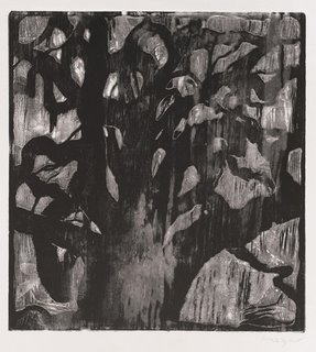 Mazur returned to expressionism, by way of traditional Chinese painting, in the ‘90s. You can see it developing in a series of flora prints in which he employs woodcuts or wood engraving. His 1988 print “Texas Tree” (left) depicts a thick, knotty tree. “Mind Landscape (Cascade)” (1995) subtly layers woodblocks, with their grain emphasized, to produce an image resembling a dreamy field of blossoms. They’re very pretty and very decorative, somehow bringing to mind Ipswich artist Arthur Wesley Dow’s Asian-inspired woodcuts.
Mazur’s recent abstract paintings of curious flat, linear shapes floating in soft fields of color struck me as uptight when I saw them at Barbara Krakow Gallery on Newbury Street last spring. A screenprint here coming out of that same style, “3 Elements” (2005), still seems uptight, but somehow I feel more willing to give it a break. A wavy brown line snakes in and out of a rectangle with a matching snaky line cut out of it. A black shape resembling a cartoon cloud floats behind. There’s something about this cloud, how it jauntily teases the stuffy design in front, that makes me smile.
“Michael Mazur: The Art of the Print,” MFA, 465 Huntington Ave., Boston, Dec. 16, 2006, to June 17, 2007.
Note: The Smithsonian's Archives of American Art has an extensive biographical interview with Mazur here.
 Here are the trapped, haunted wraiths of his “Closed Ward” and “Locked Ward” etchings and lithographs from 1963 to ’65, with which he first gained notice. They were based on his experiences as a volunteer art therapist in a mental institution. They emulate Goya and German Expressionism, and come across as overwrought, trying too earnestly to be moody and expressionistic.
There are fussy realist works from the ‘70s that recall the stuff David Hockney and New Yorker cover artists were doing then, a moody 1985 drypoint self-portrait, and figure studies from the ‘90s. His 1984 triptych “Wakeby Night” (above) is a schmaltzily pretty panorama of birches and sunflowers lined up at the sea edge, inspired by his memories of summers at Wakeby Lake on Cape Cod. It mixes lithography, woodcut, monotype and chine collé in one of those pastiches that were all the rage in the ‘80s.
 Mazur returned to expressionism, by way of traditional Chinese painting, in the ‘90s. You can see it developing in a series of flora prints in which he employs woodcuts or wood engraving. His 1988 print “Texas Tree” (left) depicts a thick, knotty tree. “Mind Landscape (Cascade)” (1995) subtly layers woodblocks, with their grain emphasized, to produce an image resembling a dreamy field of blossoms. They’re very pretty and very decorative, somehow bringing to mind Ipswich artist Arthur Wesley Dow’s Asian-inspired woodcuts.
Mazur’s recent abstract paintings of curious flat, linear shapes floating in soft fields of color struck me as uptight when I saw them at Barbara Krakow Gallery on Newbury Street last spring. A screenprint here coming out of that same style, “3 Elements” (2005), still seems uptight, but somehow I feel more willing to give it a break. A wavy brown line snakes in and out of a rectangle with a matching snaky line cut out of it. A black shape resembling a cartoon cloud floats behind. There’s something about this cloud, how it jauntily teases the stuffy design in front, that makes me smile.
“Michael Mazur: The Art of the Print,” MFA, 465 Huntington Ave., Boston, Dec. 16, 2006, to June 17, 2007.
Note: The Smithsonian's Archives of American Art has an extensive biographical interview with Mazur here.




0 Comments:
Post a Comment
<< Home