When I
panned the new Boston Institute of Contemporary Art building (above) in January, I seemed to be the lone dissenter in a sea of critical raves. But now
Philip Nobel has an essay in the May issue of Metropolis magazine (thanks to
Geoff Edgers for pointing it out) that makes many of the same criticisms of the ICA that I made, and goes on to argue that gushing critical response to new starchitecture has promoted a cycle of flashy but lousy buildings.
Nobel writes: “Bad buildings by big names get a regular pass. Favorable coverage ensues for the client. Though no connection between high-glamour architects and high-quality buildings is ever demonstrated, the client class learns anew that it pays to gamble on the stars. Other architects retool their practices to get in the game (first stop: drinks with the local critic). Students take note (fledgling critics too…). Mediocrity goes unchecked.”
Nobel runs though a list of possible reasons that critics praise poor architecture (he fails to cite specific examples beyond the ICA). One of his most fascinating suppositions is that journalists get suckered by how buildings look in photographs. He writes of the ICA’s cantilever: “the grand gesture to the sea looks great in pictures, and that serves architects and critics (and their photo editors) alike.” Or maybe it’s just that critics “imagine that promoting innovation—even just the look of innovation—is such a pure good that the defense of all other values must be suspended along with our disbelief?”
Perhaps. But Nobel seems to assume that critics are giving passes to buildings they don’t actually think are great. I think critics honestly like these buildings – they just have poor taste. And this poor taste tends in a certain direction.
What stands out in Justin Davidson’s May 14
New Yorker profile of ICA architects Ricardo Scofidio, Elizabeth Diller and Charles Renfro of New York is their fondness for purposely frustrating gestures that fight and blight their structures’ surroundings. Renfro says their style is like Rem Koolhaas and other “programmists,” meaning, in Davidson’s words, architects who arrive “at a form by assessing a client’s specific needs.”
“”Programmists have a social approach,” Renfro tells Davidson. “They’re saying that life is the interesting part, not the building.” This is a funny-strange bit of double-speak, because it’s the opposite of how they design.
Davidson describes their 1990 plan for the Slow House in the Hamptons, which never got built. The location had a lovely view of the ocean, but “The house’s piece de resistance was a monitor placed directly in front of the window, displaying a live video of the same view. The collector could stand in his living room just before dusk, and gaze at a reproduction of the sunset blocked by the screen. This was both more than a house and less – an irritatingly clever demonstration of the postmodern theory that all seeing is ‘mediated,’ and all views the product of someone exercising control.”
Or as Diller describes their 1987 installation “The withDrawing Room”: “It was about alienation and control of your space.” The problem with Diller Scofidio + Renfro-style architecture is their need to dominate the end user and that their primary tactic is alienation.
The art world – critics included – loves dominating, controlling, alienating stuff – it’s a key factor in much avant-garde art of the past century. Call it S&M style. But what can come across as “challenging” in art is another thing altogether as a permanent edifice. It’s partly a difference of the length and scale of the audience’s engagement with the thing. In a building that will likely stand for a century or more, alienating design becomes a long-term abusive relationship. It’s antisocial and mean – the opposite of what you’d want in a civic building. So why does the style persist? Could it be, as a friend of mine argues, that the popularity of S&M architecture is not just a fluke of taste, but is a display of capitalist force, an expression of project funders’ desire for social domination and control?
The glittering, jagged Rem Koolhaas-designed central public library in Seattle received raves like the ICA when it opened three years ago this Wednesday. In March, Seattle Post-Intelligencer critic
Lawrence Cheek revisited the building for a “post-occupancy evaluation.” He continued to praise the “crystal palace”s “stunning skin,” but noted that the building has an “unwieldy and
baffling vertical traffic flow” and restrooms are poorly placed.
And then he lowered the boom:
This library, incredibly, is an uncomfortable place to read. The third-level "Living Room," which has the feel of a vast indoor park, is not conducive to intimacy with a book. It harvests and energizes routine noise; conversations from hundreds of feet away coalesce as ambient babble. The vast overhead space, a thrill to library visitors, works against readers – most of us instinctively crave small, private spaces when curling up with a book. And "curling up" here is no fun. The foam seats are decidedly unpleasant and are looking shabby – cracked, torn, stained – after three years.
Critics, like everyone else, get dazzled by sensational design. And they face the problem of trying to divine how a building will function before people are actually using it. If more critics revisited architecture (and art) for Cheek’s sort of retrospective reviews perhaps it would help us all see with clearer eyes and better predict how designs will feel and function once they are built – and maybe even head off some poor designs before they get built.
What will we think of Boston’s ICA three years from now? I still feel strongly about my criticisms of the ICA building, but six months after the opening I find I misunderestimated the importance of the theater, which takes up about a quarter of the building, in the new ICA’s mission. I’m still not hot for how the theater design functions, but its programming – particularly dance shows – seems to be the sharpest, most daring stuff coming out of the ICA. And I’m curious to see how the public exterior spaces play now that it’s finally getting warm enough to use them.
Here’s my previous post on this topic.

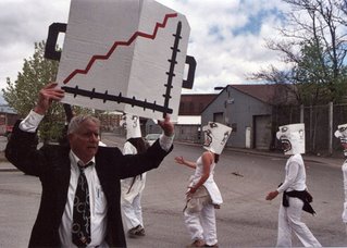
 Bread and Puppet’s street theater action, performed over and over during the march, consisted of businesspeople led by Santa Claus pulling paper masks over other performers’ faces. Then these folks walked about like stiff-jointed robots, while the businesspeople opened their briefcases to display charts of skyrocketing profits. But the robot people revolted, pulling off their masks, throwing them to the pavement and stomping on them.
 Putting it into words it sounds pretty straightforward – people under the spell of big business and Santa (think capitalist greed) come to reject these forces – but on the street it felt strange and nonsensical and not specific to the day’s theme. Bread and Puppet founder Peter Schumann (here playing the straw-masked Santa) has struggled with his metaphors of late.
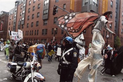
 But there were many Bread and Puppet-style costumes and giant puppets in the march – the “Property of Genzyme” mutant, the big blue person, the giant skeleton. For most part these weren’t directly affiliated Bread and Puppet, though many were operated by Bread and Puppet alums. It was more a sign of the influence Bread and Puppet has had on protest style, particularly in New England, since it formed in New York City in the 1960s.


 Oh, this final photo shows local protest organizer Klare Allen of SafetyNet being interviewed before the march began by a television reporter. I just love the expression on the reporter’s face – it was the expression she wore the whole time.


