Saturday, October 24, 2009

“ACT UP” show gets rise from right wingers

They claim: "Perversion, child pornography, anti-Catholic"


Right wingers are all hot and bothered by Harvard’s exhibition “Act Up New York: Activism, Art and the AIDS Crisis, 1987-1993,” a historical survey of 70 posters, stickers, and other graphics by artists and collectives operating under the banner of ACT UP that pushed for better AIDS treatment and advocated for gay rights. (Read our review of the show here – start halfway down.)

“This exhibit is a window into what the homosexual movement thinks of you, your children, religion, and America,” claims Brian Camenker’s MassResistance of Waltham, Massachusetts. “It involves sexual perversion, child pornography, and anti-Catholic bigotry. And it's what your ‘safe schools’ czar Kevin Jennings supports.”

The Catholic League calls ACT UP a “homosexual urban terrorist group” and the exhibit a “sick display. … Harvard, of course, would never feature a display of Klan paraphernalia and say it was being done for the purpose of ‘dialogue.’”

Fox News wonders: “Safe Schools Czar Linked to Anti-Christian Porn Exhibit?” “Obama’s safe-schools boss sponsors radical porn,” reads a WorldNetDaily runs headline. Gateway Pundit says: “Figures. Pornographic Anti-Christian Harvard Art Show Funded By Obama’s Safe Schools Czar.”

They get to Kevin Jennings – assistant deputy secretary in the U.S. Department of Education’s Office of Safe & Drug Free Schools – because he seems to have made a gift or grant to support the show. (I’m checking with Harvard to confirm that the Jennings listed as making a gift to the exhibit is the same Jennings.)

The show is filled with graphic examples of gay protest art. But I think MassResistance really means that anything homosexual is “sexual perversion.” I saw the show and didn’t see any child porn. MassResistance gives four “examples” of what it calls child pornography that aren’t actually child porn. That claim is just lies and slander. And the art's criticisms of the Catholic Church are warranted – then and now.

A 1989 poster (pictured above) in the exhibit by Richard Deagle and Victor Mendolia takes on the Catholic Church’s stand against AIDS education, condom distribution and abortion. It reads “Know your scumbags” next to images of then New York Catholic Archbishop John O’Connor and a condom. Below the condom it says, “This one prevents AIDS.”

The United Nations and the U.S. Centers for Disease Control say that condoms are highly effective in preventing the spread of the virus that causes AIDS. But during a trip to Africa this March Pope Benedict XVI revealed that the church still hasn't figured this out when he told reporters, “You can’t resolve it with the distribution of condoms. On the contrary, it increases the problem.”

Spreading that kind of ignorance gets people killed.

“Act Up New York: Activism, Art and the AIDS Crisis, 1987-1993,” Carpenter Center, Harvard, 24 Quincy St., Cambridge, October 15 to December 24, 2009.

Friday, October 23, 2009

Tomie dePaola


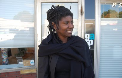
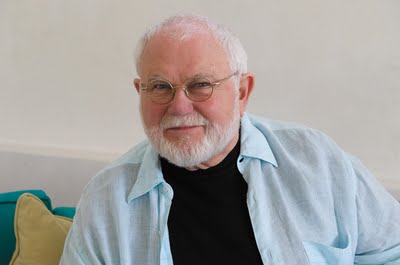
Since Tomie dePaola illustrated his first children’s book in 1965, he has authored and illustrated some 225 books including the 1976 Caldecott Honor book “Strega Nona.” Many of these are featured in a career-survey exhibition, “Drawings from the Heart: Tomie dePaola Turns 75,” at the Eric Carle Museum of Picture Book Art in Amherst, Massachusetts, through Nov. 1. I recently telephoned dePaola (above) at his home in New London, New Hampshire, where he was recuperating from carpal tunnel surgery on his drawing hand and various other ailments that forced him to very reluctantly cancel his fall book tour. We spoke about his process; about his fascination with folk tales and legends of Europe, Mexico, Native America, and the Catholic church; about his faith; about what it’s like to be a gay children’s book author and illustrator; and about his love of New England. Below are some excerpts.


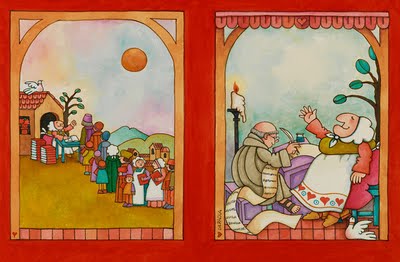
“In those early days, picture books, we weren’t able to use full colors. It was just too expensive. So the books were printed in what was called pre-separation. It would be a black base plate and then overlays. The color would be chosen in either line application or half-tone application. If you were lucky you got three colors. The average was two colors – black and one color. On many of the books, there was black and white on one page and on the following page black and the color. So I was getting messages from little kids saying, ‘You forgot to color in the whole book.’”


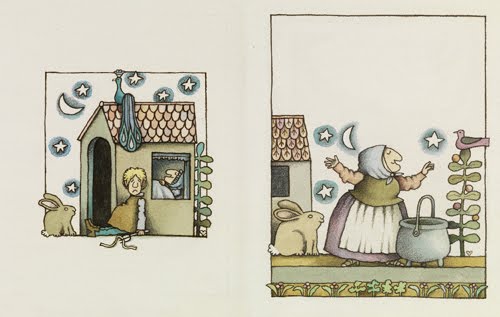
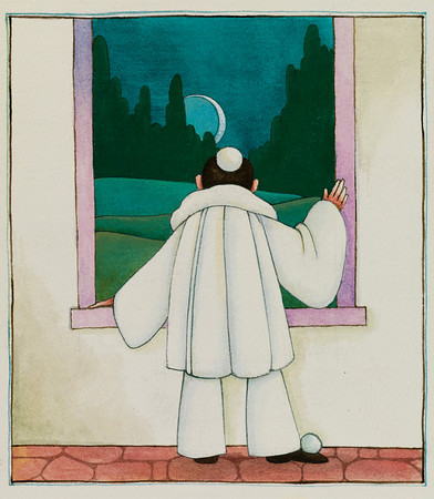
“I use acrylic. Years ago I was doing watercolor. I don’t think I’ve done anything in watercolor since after the first ‘Strega Nona’ [1975, pictured above]. Because ‘Clown of God’ [1978, pictured below] is in acrylic. They developed an acrylic that was strong enough that you didn’t have to put it on thickly. You could water it way down and it would still hold its integrity. And it was light fast. That became very important because back in the ‘70s there was a beginning of the growing market– which is still growing – of original children’s book illustration as art. And people buying it as art. Like the Michelson Gallery in Northampton, and the Cove Gallery in Wellfleet and certain other galleries across the country that actually sell original children’s book illustration. So that’s when I switched to acrylic … On top of that I do paintings and drawings that are non-books. A lot of people don’t even know I do that except the people who go to see my gallery shows at various places. I’ve always shown in art galleries as well as through the book publications.”


“I don’t have any secrets of working. I get an idea. I discuss the idea with my editor. It goes around and around. Then I sit down and write the text. Sometimes the text comes very easy. And sometimes it’s a real struggle. There are different kinds of texts that just are cranky and others that just flow out onto paper. And then always the editorial process, which is a very interesting process for me, discussing it with the various editors that I work with. In the meantime, we kind of are settled on the size. That, of course, is all agreed upon by sales and marketing these days. And bookstores, because bookstores don’t like books that are too big, that they can’t shelve. So there are sort of standard sizes. And I discuss that with my art director. Then I start to fool around and see how I want to express the art in this particular book coming up and what technique I’m going to use and what materials I’m going to use. Quite often, if the book is one of my autobiographical picture books or a ‘Strega Nona’ the style is pretty well set. The ‘Strega Nona’ books all look alike, and they should. The same with the books about myself as a little kid. Then I have a chance to branch off into things like ‘Adelita’ [2002, pictured below], the Mexican Cinderella story that I created. Then I branched out recently into some little forays into collage. There’s a book called ‘Song of Francis’ [2009] and I did that all in collage.”


“Years ago the great artist Ben Shahn, I heard him give a lecture called ‘The Shape of Content.’ He strongly felt that the old masters and the pre-Medieval painters, like Giotto and Fra Angelico, their shapes and their style were really in sync with the content of their images. Fra Angelico used the Romanesque rounded arch over and over again to set up a rhythm of calmness. And he only painted calm scenes. There’s very few Fra Angelico crucifixions. They’re mostly annunciation or birth of Christ, etcetera. For me that’s part of my personal training. … Certainly if I’m going to do a New England group of folk tales or folk sayings I’m going to make the landscape and people look as New Englandy as possible, and the same with Mexican or Italian.”

“I hate to do sketches. So I go from little tiny thumbnails on toilet paper to pencil drawing on my expensive watercolor paper and go right to finishes. I give them the option, I say, ‘I’ll do it over if you insist.’ But, of course, they don’t ask me to do it over very much. Every once in a while. Not too often. I found out there’s some people that thrive on doing these elaborate sketches, layered sketches. I find that my art dies. I lose the spontaneity of the spirit of my hand, my signature, my calligraphic line.”

“I think one of the most important things for the visual artist is to have self-criticism. Most artists I know know when they do something really lousy. And if they don’t know they’ve done something lousy the kids will tell them. They’re not shy about it at all.”


In the 1950s, you considered becoming a monk? “Yes, at the Benedictine community and Western Priory in Weston, Vermont. The monastery is still there. There’s 12 men. They’re very good friends of mine. As well as the Benedictine nuns at Regina Laudis Abbey in Bethlehem, Connecticut. I think it was more that there were other things for me to do with my life, and one of them was to really and truly be a full-fledged artist. If you’re a monk artist, you’re really divided in your priorities. But I’ll never regret any of the minutes I spent in the monastery, or my wanting to explore it, because it certainly added to my own personal spiritual life. I consider myself a good Benedictine in my soul. As I say, I’m still very friendly with the Benedictines. I was only there about six months the first time. I tried three times – 1956, 1966 and then a very brief couple weekends in ’70, ’71. I gave it the good old school try.”

On Sister Corita Kent: “We showed at the same gallery [Botolph Gallery in Boston]. We became friends. We were kind of in the same Catholic liberal [group]. This was during the Vietnam War, and there was a whole group of us, and a lot of contemporary liturgical artists. From the time I was in art school I was always interested in contemporary liturgical art, because I always thought the art of the contemporary Catholic church was horrible, sentimental. And when you compared it with the beautiful pre-Renaissance, the beautiful Gothic cathedrals and the Romanesque carvings, spirituality had gone out of the buildings and the artwork. I’m talking about the kind of church I went to as a child. It was all the glass-eyed statues and all this over-decorated stuff and these sappy stained glass windows. You go compare a window at Chartres or Notre Dame de Paris to Boston Cathedral, one is schlock and one is art. That is not to say there aren’t some beautiful contemporary [churches]. In fact if you want to see some incredible contemporary stained glass windows go to St. John’s Abbey in Collegeville, Minnesota. Their abbey church was built by Marcel Breuer. And several of his friends, including Josef Albers, did the windows.”


“That was a very interesting time to be a liberal Catholic. The Berrigan brothers were alive and well. I was teaching at Newton College of the Sacred Heart at that time, the early ‘60s. I was actually teaching in the Boston area and living in New York. So I was commuting. It was a quite interesting time because of the Berrigan brothers and the Immaculate Heart Sisters in Los Angeles and Corita and a wonderful man named Norman Laliberté, who still lives in the Boston area.”

Laliberté “did these incredible banners. The bunch of us were all excited because suddenly the church – whatever that meant – had the opportunity to be a patron of the arts again. But it was short lived. It got very confusing. And I think what happened is there was stuff going on in the Vatican, they saw power slipping away and suddenly this whole thing came to a grinding halt.”

De Paola left the Catholic Church around this time. “The writing was on the wall that the political forces that were going to control the church were more conservative and more party line and not interested in maybe more social justice, etcetera. I think a lot of people did get very disillusioned. … Then the Vietnam War started and we kind of took our energies from trying to make our sacred spaces more sacred and less sentimental.”


“‘Strega Nona’ was based on an old folktale called ‘The Porridge Pot Story.’ That was kind of de rigueur. Illustrators were doing a lot of folk tales because librarians loved them. I was brought up with my mother reading me folk tales and legend. I loved folk tale and legend. I think it’s just that it touches part of the soul of man.”

You’ve done big public lives of saints. “This is an interesting thing to me. I’ve gotten sort of pegged doing, you just said, ‘big lives of the saints.’ Now I’ve done four small picture books on the lives of certain saints. And they’re certain saints that are kind of appealing to non Catholics as well as Catholics. And not a one of them has any proselytization in it. I did it because they were good stories.”


“I see the legend of St. Christopher as a very beautiful legend. St. Christopher was thrown out of the calendar of saints during Pope Paul VI. When that happened I said, ‘Oh, come on, that’s ridiculous.’ It doesn’t matter whether he truly lived or not. The legend has a message to it and it’s a beautiful legend, and I’m going to rewrite it and re-illustrate it. … I’m interested in these saintly figures or Biblical figures or traditional figures that are gentle like this gentle giant [Christopher], like Benedict and Scholastica, who actually lived, and formed Western monasticism. And who knows whether Pascual lived or not. That’s another little legend, a Spanish saint, the patron saint of cooking. And the way these people become saints of whatever they’re doing is sometimes really interesting, kind of childlike, and it’s a good story. There was a great English spiritual writer of the late ‘30s, early ‘40s, her name was Caryll Houselander. I loved her writing very much. She was a very, very deep spiritual writer. She made the statement once that people should publish these wonderful legends and stories about the saints because they read like fairy tales. I said, ‘Oh, that’s a very interesting idea. I think I’m going to try that.’ And it’s part of my growing up. I heard those stories as a child. … And nobody seemed to care whether Christopher really lived or not. I loved it when he was thrown out of the calendar of the saints and several Jewish friends of mine said, ‘Well, I’m not getting rid of my St. Christopher medals.’ Everybody I knew had St. Christopher medals because he was the patron saint of travel.”


What is it like to be a gay children’s book artist? “It’s probably one of the best fields to be gay in frankly. I found out right from the get-go it made absolutely no difference amongst the editors and the professionals. I imagine there’s some danger if some born-again Christian school out in Midwest finds out. ‘Oh my God, get him out of here.’ But I’ve never had any problems with it. And, of course, there’s so many gay and lesbian people in the field that it’s sort of a moot point. I think it allowed me the opportunity when I was a child not to waste my time batting my head against other people on the football team but to sit and draw. And to take tap dancing lessons and find out about the great world of the stage.”

Which comes up in your book “Oliver Button is a Sissy” (1979): “That book is still in print. But I have to say that personally I’ve never had anything really horrendous happen to me, that I’ve had to ‘face.’ And now I really do think it’s a moot point. Barbara Lucas, who was my editor for ‘Oliver Button,’ I think she was pretty brave to publish it back when it was published. It’s had a long life. And I don’t think it got pulled off shelves as much as the more politically-oriented books like ‘Heather Has Two Mommies.’ Because of the age of the character of the book, sexuality doesn’t play a part in it at all. … It was about being different.”


How did you come to the New England tales in “Front Porch Tales & North Country Whoppers” (2007, pictured above)? “I live here. It’s about time that some of these old New England shaggy dog stories are resurrected and put in a collection, at least the beginning of a collection. And, who knows, there may be another volume of those. I moved to New England in 1956. Right out of art school, I entered the monastery. Then left, and came back almost immediately to live in the town of Weston, Vermont, in the middle of the Green Mountains. It was a little mountain village. We were pretty isolated every winter. You’d have to drive all the way over to Bromley and Route 7 to get to Rutland from Weston. We really did have mud season. There was no such thing as paved roads. There were a lot of these wonderful Yankee stories. And a lot of them are getting lost.”

“Since I’ve lived in New London from ’72 I’ve seen a huge change. A lot of the old timers have died off. There are a lot of people moving in from Massachusetts and Connecticut. The kids don’t have farm work to do after school anymore. It’s a totally changed community from what it was when I first moved here. It was a very agricultural community. We do have a nice farm stand. We do have some sort of nice farms. It’s mostly a retirement community for people who have moved to the country for ‘the good life.’ And, of course, what they want is the good life that they used to have in Massachusetts. So I wanted to preserve some of those very funny stories. And I hadn’t seen anybody doing it in a way that I felt I could do it.”

“They’re part of the fabric of the culture, of the place. If I express some of those things that are in ‘Front Porch Tales’: ‘Have you lived here all your life?’ ‘Not yet.’ I’ve never heard that joke from somebody in the Midwest. They have different jokes.”


“There’s that story in ‘Front Porch Tales’ of my friend Jack and I being invited to set with Maude and Frank Stevens one Saturday night. And that’s an absolutely true story. We sat there. We didn’t say a word. Maude made fried doughnuts. We sat there. The clock ticked. Finally, Lonnie Fuller said, ‘Well, I’ve got to be going. Really nice settin’ with you, Frank.’ We got in the car and I was like, ‘What the hell was that all about.’ We didn’t say a word. Nobody said a word. And I wasn’t about to because I was the youngest one there. I was 21. And I was an artist. And I had been with those monk fellows for a while. It was like going to the moon. But it was fascinating and it was fun.”

“There were really were these old timers that would sit on the front porch of the country store and just have comments about everything. I really did hear, my own ears, I heard an old farmer on the front porch of a store, when a tourist stopped and said, ‘Excuse me. Do you know the way to Rutland?’ he said, ‘Aiyah.’ And that was his answer.”

What keeps you in New England? “It’s that independence. It’s that hard working. It’s the change of the season. It’s the fact that we still have town meeting here. It’s the urban quality but it doesn’t have this frightening Plains huge expanse of prairie that I find a little disturbing. Whereas people that come from the Plains and come to a small New England town feel hemmed in. I said once to some school children, they said, ‘New Hampshire’s very small on the map.’ I said, ‘Well, no. It maybe looks small on the map, but there are a lot of mountains in New Hampshire and if you ironed it all flat it would be just as big as Minnesota.’”

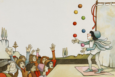
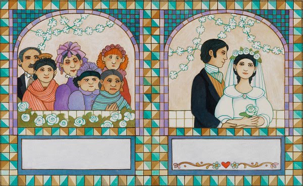
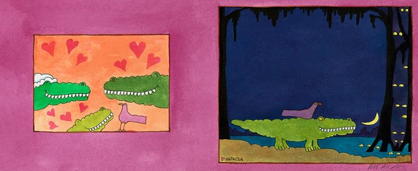
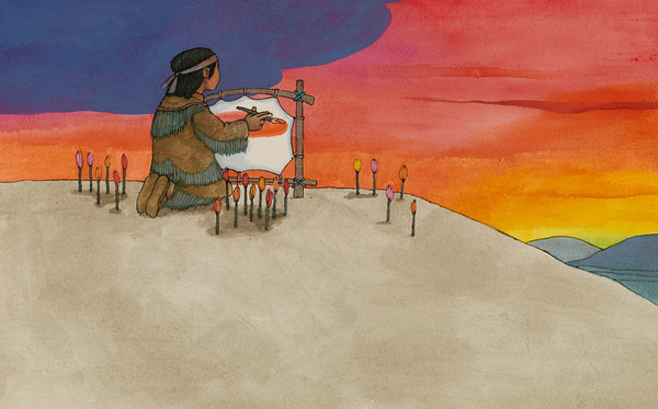
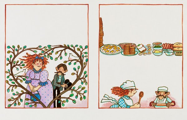
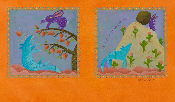
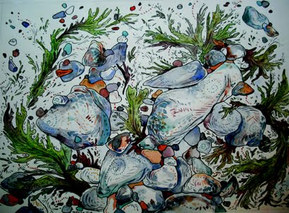
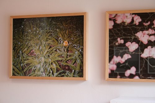
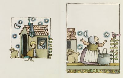
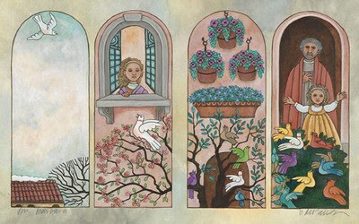
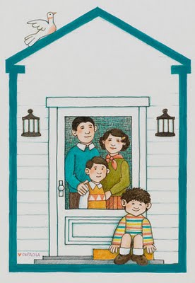
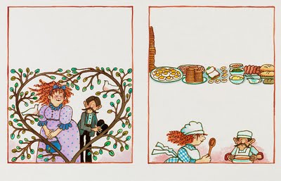
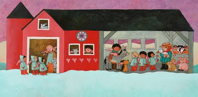
“Drawings from the Heart: Tomie dePaola Turns 75,” Eric Carle Museum of Picture Book Art, 125 Bay Road, Amherst, Massachusetts, July 3 to Nov. 1, 2009.


Pictured from top to bottom: Tomie dePaola portrait courtesy of Whitebird Inc.; and illustrations from: “Strega Nona: Her Story” 1996; “Strega Nona” 1975; “Clown of God” 1978 [Harcourt Brace Jovanovich, 1978]; “Adelita” 2002; “Days of the Blackbird” 1997; “Sing, Pierrot, Sing” 1983; “Bill and Pete to the Rescue” 1998; “Legend of Indian Paintbrush” 1988; “26 Fairmount Avenue” 1999; “Front Porch Tales & North Country Whoppers” 2007; “Country Angel Christmas” 1995; “The Tale of Rabbit and Coyote” 1994. All copyright © by Tomie dePaola in the years listed above.

"Do It! Show It! Sing It! Work It!" at AS220


From my review of "Do It! Show It! Sing It! Work It!" plus Holly Ewald's "Languages of the Land, A Dialogue with The Downs" and the artists' book exhibit "In Place, Elsewhere: Artists" at AS220 in Providence:
It's not quite right to call "Do It! Show It! Sing It! Work It!" the AS220 biennial. This fizzy hodgepodge of art by AS220 staff, residents, volunteers, and fellow travelers is not as serious the term "biennial" implies. This is more like a hootenanny, lots of different voices, not all singing in key.

Among the highlights of the show, which is on view in AS220's main gallery (115 Empire Street, Providence, through October 24), is AS220 program director Meredith Stern's Cast Your Spell, a collage of relief prints. The title floats over two squirrels juggling leaves over a pot on a campfire, with rodents perched on their backs. Several more critters flank them. Stern expertly makes her scratchy gouging to suggest fur and motion. It gives the print a buzzing woodsy energy.
Read the rest here.

"Do It! Show It! Sing It! Work It!" in AS220's Main Gallery, 115 Empire St., plus Holly Ewald's "Languages of the Land, A Dialogue with The Downs"and the artists' book exhibit "In Place, Elsewhere: Artists" in AS220's Project Space, 93 Mathewson St., Providence, Oct. 4 to 24, 2009.

Caleb Neelon


From my report on Cambridge artist Caleb Neelon's "Imagination Wall" mural at Children's Hospital Boston:
One after another, young patients approach Caleb Neelon as he paints in the lobby of Children's Hospital Boston. They marvel at his folksy, cartoony, Technicolor mural, and offer suggestions. The sea that his patchwork ship floats upon, a boy advises, could use some sharks with pickles.

The piece is called "Imagination Wall," and Neelon is specifically seeking ideas from and interaction with the youth currently at Children's for treatment. The 33-year-old Cambridge street artist has painted walls from Brazil to India to Iceland — with and without permission. "Graffiti is one of those funny scarlet-letter things," Neelon says. "Once you're in it, you're in it forever. Which is fine with me."

Increasingly, though, he is becoming a gallery artist, the sort of respectable fellow who wins grants and commissions ? including previously painting decorations at the hospital's Yawkey Family Inn on Kent Street, which provides housing for families while their children receive treatment. It's an acknowledgement of both his art's charm and the ever-greater official embrace of graffiti.

"I've wanted to do more hospital projects for a long time," says Neelon. "Boston is a good art town, not necessarily a great art town. Boston is absolutely a great hospital city."
Read the rest here.

Previously:
February 2009: Our profile of Neelon.
April 7, 2009: Neelon: Fairey's arrest hurts Boston biz.

Caleb Neelon "Imagination Wall," Children's Hospital Boston, main lobby, 300 Longwood Ave., Boston, Sept. 21, 2009, to March 2010.

Thursday, October 22, 2009

"Yesterday Today and Tomorrow" at Stairwell


From my review of the group show "Yesterday Today and Tomorrow" at Stairwell Gallery in Providence:
Haley O'Connor, the co-founder of Stairwell Gallery, includes a few of her own photos in the gallery's new show, "Yesterday Today and Tomorrow." Two depict plants, blurrily pulled out of darkness by a blast of flash. The blur, the obliterating glare of flash are classic photography don'ts. But O'Connor sees in them potential -- like a wizardly spark -- for visionary images unique to the medium. "When you can capture magic and it's unbelievable," she tells me, "then you're doing what you can do with nothing else."

I don't feel that magic. But her images and the work of the five other photographers here provide a survey of a style percolating among ambitious art photographers under, say, 35. It can feel like a search for visionary experience amidst banal everyday America. It often seems to incorporate the vivid snapshot aesthetic of Nan Goldin, '80s nostalgia, and glimpses into the lives of dissolute angelheaded hipsters.
Read the rest here.

"Yesterday Today and Tomorrow," features photos by Haley O'Connor, Natalja Kent, Asher Penn, Jack Ritchie, Ports Bishop and McKenzie Burris-Granger, Stairwell Gallery, 504 Broadway, Providence, Sept. 27 to Oct. 25, 2009.

Pictured from top to bottom: Photos by Haley O'Connor, Natalja Kent and Haley O'Connor.

Wednesday, October 21, 2009

John Willis and Tom Young


From my review of "Recycled Realities," photos by John Willis of Dummerston, Vermont, and Tom Young of Charlemont, Massachusetts, organized by Rhode Island College teacher Amy Montali at the college's Bannister Gallery:
Mountains of printed paper waiting to be recycled at a mill nestled in the hills of Erving, in western Massachusetts, provide inspiration for the series of black-and-white photos. Willis and Young excavate the imagery inside bales of torn and shredded paper. Here are crumpled prints of glass eyes, or smashed and diced photos of a boy's sad face. Photos reproduce images of saints, a monkey, and a boy, and Civil War soldiers next to a reproduction of Renaissance painting.
Read the rest here.

"Recycled Realities," photos by John Willis of Dummerston, Vermont, and Tom Young of Charlemont, Massachusetts, at Rhode Island College's Bannister Gallery 600 Mount Pleasant Ave., Providence, Oct. 1 to 29, 2009.

Pictured from top to bottom: Photos by John Willis and Tom Young.

“Drawings that Work: 21st Drawing Show” at BCA


From my review of “Drawings that Work: 21st Drawing Show” at the Boston Center for the Arts:
"Drawings That Work," the 21st annual "Drawing Show" at the Boston Center for the Arts' Mills Gallery, surveys drawings as preparatory studies. It's an intriguing way to frame the show: how do artists think things through on paper?

The standout is pyrotechnics artist Ken Clark's sketches for his design of a 2001 fireworks display in Pennsylvania; they're exhibited with video of the actual fireworks. (The show as a whole could benefit from more preparation-and-result pairings.) X's and lines fill 32 sheets of graph paper like musical notation for the choreography of "sunball crossettes," "purple peonies," and "gold flitters." It's not the draftsmanship that pulls you in but the privileged glimpse into the pyrotechnic craft. Another highlight is Matthew Rich's colored-pencil sketchbook sketches of urgent little abstract rainbows and diamonds.

But most of the pieces by 36 artists picked by guest juror Andrew Stein Raftery — an engraver who teaches at the Rhode Island School of Design — just aren't that interesting.
Read the rest here (at the bottom).

“Drawings that Work: 21st Drawing Show,” Boston Center for the Arts, Mills Gallery, 539 Tremont St., Boston, through October 25.


Pictured from top to bottom: Matthew Rich, “Sketch for Striped (Sketchbook #2),” 2009; David Teng Olsen, “Never Ending Story”; Clara Lieu “Sculptural installation,” 2009; Nataliya Bregel, “Beit Yanai: Dog Walkers,” 2009.


Tuesday, October 20, 2009

GASP marks five years


From my report on GASP gallery in Brookline, Massachusetts, celebrating its fifth anniversary:
At the end of August, the seven-month-old Massachusetts Creative Economy Council released its first report on the state of culture here. “Is MA sexy?” one of its subcommittees asked about the Bay State. “People see us as conservative. This needs to be ‘the’ hot place to be.”

“I think that this is not a true portrait of Boston,” says renowned artist Maria Magdalena Campos-Pons (pictured above). “I think that intelligence is sexy. Knowledge is sexy. Curiosity is sexy. Research is sexy. And that is Boston. I don’t find frivolity sexy. I don’t. So it depends what you look at.”

Note that, though her words fit the city’s intellectual life in general, they don’t necessarily describe the Boston art scene. “I made GASP because of that reason,” says Campos-Pons. “I wanted a little more juice.”

GASP is the Gallery Artists Studio Projects, a Boston workspace/gallery she founded with her musician husband Neil Leonard in summer 2004.

“Whatever we don’t have [in Boston] we make,” says Leonard. “And GASP is one of the ways we do that.”
Read the rest here.

Previously:
Our 2007 profile of Maria Magdalena Campos-Pons.

GASP holds “Bag It,” an auction of artist-decorated shopping bags, at the gallery, 362–364 Boylston Street, Brookline, from 6 to 9 p.m., Oct. 23, 2009. Admission is $50, or $100 to become a “friend of GASP.”

Photos by The New England Journal of Aesthetic Research.

Maria Magdalena Campos-Pons interview


I interviewed Brookline artist Maria Magdalena Campos-Pons at GASP Gallery in Brookline, which she runs with her husband Neil Leonard, on Oct. 8, 2009. We spoke about the gallery, about the state of art in Boston, and about her proposal for a Boston drawing biennale. Below are some excerpts:
  • “You see a lot of art from Europe in the city [Boston], but you don’t see a significant amount of art that is coming out of the South. And I am interested in that. I don’t want to be: you go to Venice, you see the art in Venice, and then you bring it to Boston. You go to New York, you see the art in Gagosian [Gallery] and then you bring it to Boston. Actually, we are a little more outside the predictable. We want to think about these are a group of interesting artists, let’s bring it to Boston. They don’t need to be approved by the Venice Biennale, they don’t need to be approved by Gagosian or whatever it is. … That’s what we are interested in. Art exists in a realm that is not just in the official stamp by the institutions that establish value. And that’s what we are. And that’s what we care for. So Liliana Angulo is an extraordinary photographer and we brought here. She’s a Columbian. I mentioned her name, I could mention other names.”

  • “When I’m thinking of GASP, I’m thinking of word of mouth. What are artists thinking that is interesting? Not just what the establishment of the curator class is thinking is exciting. Because we ask artists to propose ideas. So they are thinking this has a value. We want to show that. We want to see that. We’re putting attention to that. Some museums are doing that now. … It’s a very different dynamic. We have curiosity about that. We don’t have any anti position about what other institutions are doing.”

  • “I didn’t start a gallery. I started a project. I don’t consider GASP a gallery. I consider GASP an artistic and civic project. This is not only a space to express ideas artistically but it is a space to engage civically, socially. So I see that as a commitment as a citizen to a stamp of values and ideas that I believe are important. So I see that as a parallel.”

  • “I was challenged by the [Brookline] neighborhood, by the locality. I was thinking what an interesting spot to have art, and why is there no art there. I would have done GASP in any part of Boston, wherever I be. I have been thinking that I want to do something in Boston for a long time. I wanted to see a dynamic of things in a different way. I don’t think that I like to criticize subjects. I like to act on things. So rather than say: This is not working. I want to say: Let me do something.”


  • “The model of curatorial work is so old, it’s so 20th century, and it’s post-19th century in a way. It’s so elitist. It’s so centered in the opinion of the few chosen. And I refuse to accept that. And I hope that I’m not going to make all the curators now my enemy and I’m going to be right out of everything. I benefit from that and I respect the structure and the rationality beyond that. But I think we are in a moment where things could be richer, more open because of the time that we live in and the way that we live. And I want GASP to be that. I want GASP to be in that kind of milieu, more opportunities to think and to come and to be.”

  • “In my belief some of the best work that people ever produce they produce in the later years of school. And that’s true for me too. After that a lot of limitations are placed. Cindy Sherman made her ‘Stills’ when she was still in school. Ana Mendieta, some of the most spectacular work that she produced, she did in the University of Iowa.”

  • “I live in Boston. I’m not intending to move. Maybe I should. But I’m not planning to do that. I love Boston. Always when I’m abroad, when I am outside I talk a lot about Boston. I think that it is an interesting city. I think that it is a city that challenges you intellectually. I think that it is a city of knowledge. If you were going to talk in 19th century terms, it would be like illuminated. And I think that it’s a city that could benefit from having people like me. I am not so Bostonian. I am not so engaged with the scene that made Boston, that Boston is. And in some way, maybe this is selfish, I think that I refresh Boston in a way. The kind of energy that I have. Boston is more self-contained, less exuberant. And I think that I was looking for a little bit of exuberance, a little bit of unpredictability to it. But I love the freshness of Boston. It’s a young city always. And the reason that it is always young is that it is a city of students. And I think that that gives Boston such a rapport. It’s a city in which you need to keep yourself alert. If you want to be effective here, you need to be thinking and you need to be an active thinker. Otherwise, everything passes by because people are on the move. People don’t come here to stay. They come here to pass by, acquire something and then go.”


  • “People say that Boston is a quiet city, that nothing happens here. But, really, if you are engaged with what happens in this city you don’t have free time. I cannot keep track of what happens, I cannot follow what I want to follow in the city. I don’t have the physical time or hours to see or participate in everything that’s happening in the city that I want to be part of. Period.”

  • “Maybe what I like about Boston, what challenges me about Boston, is what I’m not. Boston is a city that offers a lot of resistance to a new-comer, a lot of resistance to break through. But the beauty is that and yet this is a city that opens up. And yet this is a city that is exciting if you look for it. I go to Paris and to London and to New York and Dakar, everywhere, Tokyo, and I’m still coming back and thinking it’s interesting to be here. It’s not that dour. I am in New York and I come back and I say here is different, but in the differing there is some beauty there. All that I do is when I’m bored, I just take a plane and leave. [she quips:] And that’s often.”

  • A subcommittee of the Mass. Creative Economy Council recently asked: Is Massachusetts sexy? Their answer is no, it’s conservative. “I think that this is not a true portrait of Boston. I think that intelligence is sexy. Knowledge is sexy. Curiosity is sexy. Research is sexy. And that is Boston. I don’t find frivolity sexy. I don’t. So it depends what you look at.”

  • “What is missing here is the sense of a togetherness as a city. You think in New York they take so much pride in being a New Yorker. We need something like the Red Sox cheerleaders. So much pride about being an artist living in Boston because we have this institution and this institution and they’re all doing fabulous stuff.”

  • “I travel a lot. Maybe the other thing is I see a lot of things outside Boston. So maybe I don’t see what is missing because I fill myself with so many other things out there that I balance that.”


  • For at least a couple years now Campos-Pons has mulled the idea of founding a Boston Drawing Biennale. “I have been thinking for a long time, in all my traveling, in all the cities that I have been in the First World and in the Third World, what could be a moment of currencies, what could be the thing that joins together and then brings this city together with force in the visual arts? When I curated that show of drawing [at the Boston Center for the Arts], I saw so many drawings, so many works done by many artists, and drawing came as an interesting territory to explore. And I have been working with a little task force just to try to define if we do that what it could be and when it could be. We have been talking for a long time in terms of biennale. … Maybe it doesn’t need to be an biennale. Maybe it could be some sort of different kind of format. I don’t want to call it a festival. What we have done now is just to pass to a different number of people just a little write out to see if this idea is valuable. The idea is to bring together all these institutions. To bring together the forces that are separated between the Harvard Museum, the Museum of Fine Arts, the ICA, MIT, Isabella, all the colleges, and find the way that the entire city becomes a force with some kind of umbilical cord – the umbilical cord could be drawing – and really make Boston a destination. And seriously we could bring people together for that and see what kind of response. At this moment it’s just a big conversation still. But a serious conversation. I just want to be sure that it happens. I want to keep talking. I don’t want any other road except the road that it happens.”

  • “I don’t know maybe it is the Boston Drawing Editions. I was thinking it’s a commitment. When you say a biennale you commit yourself to every two years to create something that requires a lot of infrastructure. However the idea for this project is just that. The idea is people coming in mass to Boston to see this project. We gain tourism. We get visibility. We get everything. We’re thinking that we could do it. All the talking here that I have been passing this idea, everybody says excellent, brilliant. The question is, I know in Boston to lift something out of the ground you need to push. But I hope that we will manage to do it and it is something that will happen in one format or another. It could start in one institution. It could be one institution is the mothership to start it. And that year’s edition is in that institution. And the next, two years, three years, edition is in another institution.”

  • “I don’t think Boston has yet become a destination. People don’t come to Boston from elsewhere. … We want to be a destination. I would like to be part of something that people say can’t miss it, you need to be there. … I think it hasn’t yet gotten that punch in which people say we need to come this week to be in Boston because there is going to be this body of work that we absolutely can’t miss. So we need to talk. I hope that a lot of people will be at the table.”
Pictured from top to bottom: Maria Magdalena Campos-Pons's 2002 photograph "Elevata" which includes her self-portrait; Campos-Pons unpacks a sculpture arriving for GASP’s “Bag It” auction; the GASP group exhibition “Near Everywhere,” from March 27 to May 2, 2009, featured from left to right art by Ellen Driscoll, Marguerite Kahrl and Jane Marsching; GASP's front door; GASP’s election results party on Nov. 4, 2008. Photos by The New England Journal of Aesthetic Research, except for “Elevata.”

Neil Leonard interview


I interviewed Brookline musician Neil Leonard (above right) by phone on Oct. 9, 2009. We spoke about GASP Gallery in Brookline, which he runs with his wife artist Maria Magdalena Campos-Pons. We spoke about the start of the gallery, which is celebrating its fifth year, and its “Sonic Arts” program, which he oversees. Below are some excerpts:
  • “Magda needed a studio. This was the primary need. So she found a space that was near to the place where we were living. It was two stories. And she figured she could put her studio at the top and a small gallery at the bottom. My first thought is this is absolutely crazy. We have no time in our lives to administer a gallery, much less what I think she was really thinking about, which was an art center, which would have an educational component, which would have an exhibition space, which would have a concert component. Which is in fact what we have done. My first sense was really I couldn’t take on more because between teaching, performing, parenting I was absolutely full. There were two reasons that went forward doing this together. Number one, I could see that Magda really wanted to do this and it was going to go forward regardless of any caution I might suggest. The other thing was Magda in Cuba was involved as both an artist and a person working in arts administration … She had already been involved as a kind of spokesperson-catalyst in the arts. And I think catalyst is a real thing that appealed to her. Apparently that interest never went away. The fact it didn’t work out there, didn’t mean that it was impossible to do.”

  • “One of the things we wanted to experiment with was what does it mean to work with artists of the highest caliber when you’re not a major institution. What I’m getting at is there’s a completely different dialogue that we have with artists in this initial phase where we were kind of doing it all out of our pocket, where essentially we were going to peers or peers would approach us. And they knew what this was, they knew we didn’t have a Mass. Council for the Arts grant, or we didn’t have an NEA grant, or we didn’t have a private sponsor who was covering costs. They know this was something we were kind of doing out of our pocket. They were interested in a combination of things. One they were interested in the venue. In the case of [saxophonist and composer] Steve Lehman, or [composer] Amnon Wolman who did a sound installation in the very beginning in 2005, they were making new work that they wanted to show and they felt they needed to show in order for the work to develop. And they were not working for Documenta or the Venice Biennale or the MoMA or the ICA, one of those blue chip venues to show their work. They wanted a sort of underground place, a small community where they could show their work and they knew that the people they were showing their work in that kind of delicate stage would understand what they’re doing.”

  • Magda “She’s always said it’s not where you are, it’s what you make of where you are. … You can do it in Boston. Magda has personally been an example, has shown in the highest level of venues in the world and hasn’t chosen to live in New York. … She’s made herself an example of that personally.”

  • “Whatever we don’t have [in Boston] we make. And GASP is one of the ways we do that. And it’s not just recreating New York.” It aims to take the best of all the places they’ve been, from New York to Canada to Cuba to Italy. “And people from all these places come seek us out here.”

Monday, October 19, 2009

Robert Indiana


Some of Robert Indiana’s earliest surviving artworks are drawings dating back to 1945, when he was 17. They ape the style of Reginald Marsh, who painted gritty, gaudy, sleazy, open-24-hours America, the America of movie houses festooned with advertisements, of shop window mannequins and carnival midways and burlesque shows, the America of bustling neon streets in the shadows of elevated train tracks at night.

A decade later, as you can see in the survey exhibition “Robert Indiana and the Star of Hope” at the Farnsworth Art Museum in Rockland, Maine, Indiana would turn to African tribal sculptures and traditional Asian banners for inspiration – sources Europeans had drawn from when they invented Modern art. But by the end of the 1950s, he was looking at America again, to roadside advertisements and pinball machines, and, later, the symbols of fraternal halls like the Star of the Sea Oddfellows Lodge on Maine’s Vinalhaven Island, in which he has lived since the 1970s. He seemed to recognize these vernacular graphics, the iconography of Marsh’s America, as an American folk art, as commercial and practical and rough and tumble as the people themselves. And they would become the jumping off point for all that followed.

Indiana, who is famous for his “LOVE” logo, has called himself “an American painter of signs.” The statement is often interpreted as a self-deprecating comment about his art. But it likely has a double meaning describing Indiana’s love of speaking in code, in signs. His symbols are generally autobiographical, or encrypted emblems of a gay man painting in straight America. An example: his frequent use of the word “eat,” Indiana has said, refers to his dying mother’s last words, asking if he’d had something to eat.

The transition from his early crusty paintings of elongated heads, with echoes of African sculpture and Byzantine icons, to his signature Pop Art signs is a group of flat abstract works from 1959. These "Source" paintings feature black seed shapes nested in green or brown saddles. The flat, abstract compositions evidence the influence of – or at least kindred thinking with – his friend, and reportedly then lover, Ellsworth Kelly.

With that addition of hard-edge abstraction, all of the formal components needed to invent Robert Indiana were in place. It’s no coincidence that around this time he dropped the last name he was born with, Clark, in favor of a new name honoring his native state.

By 1960, Indiana was constructing sculptures from wood beams and charismatic junk that he scavenged among the old buildings and crumbling piers near his studio in lower Manhattan. (Unfortunately, they’re mainly represented here by bronze reproductions from 1991.) He mounted the beams upright and attached rusty wheels along the sides. He painted them with circles and triangles like stoplights, and stenciled on numbers and words (“orb,” “eat”). Formally, the sculptures sit somewhere between Modernist assemblage and backroads folk sculpture, with hard-edge abstraction masquerading as street signs. They register as strange weathered holy totems of roadside America.

Indiana called them “Herms,” after ancient Greek and Roman road markers, usually topped by the head of the messenger god Hermes and featuring a phallus. Mr. Indiana’s version is similarly gendered, frequently with a stiff wooden peg projecting from the front.

His 1964 sculpture “Electronic EAT” (the indoors one, not the one atop the museum) is a black metal circle behind white capital block letters, filled with flashing white lightbulbs, that spell out the title. The lights jitterbug in alternating patterns. Minimalist simplicity that generates megawatt effects is the hallmark of Indiana’s crackerjack graphic design. And always his primary strength. When he tries to get realist in paintings of his parents or Marilyn Monroe the results are stiff, awkward. Maybe we should call it crackerjack compositional skills for those who still rank graphic design beneath “fine” art. Whatever you call it, Indiana magics the commercial into a transcendent experience.


If you need additional evidence of Indiana’s design chops, here’s “LOVE,” which originated as a 1965 Christmas card for New York’s Museum of Modern Art. (An original is displayed here). One gallery is wall to wall with “Love” prints and painted bronzes, in English and Hebrew and Chinese. The idealistic emblem spawned a 1973 postage stamp and an industry of unauthorized knockoffs, becoming as ubiquitous as the yellow smiley face (c. 1963) or Milton Glaser’s “I (heart) NY” (1975). It’s so familiar that it’s impossible to see it afresh. “LOVE” is like a catchy, old top 40 hit – you wish you could get the schmaltzy hippy dippy chorus out of your head.

“LOVE” caps the most exciting moment in Indiana’s career. Some of the fizz is lost here as the show is drawn almost completely from Indiana’s own collection, leaving notable absences – like paintings riffing on gas meters and pinball machines. After this, he would mostly repeat himself with ever reduced returns. His “Hope” painting, a text piece that borrows the signature slanted “O” from his “Love” paintings, was commissioned for Barack Obama’s campaign last year, though he had been exploring the motif previously. It feels phoned-in, a knock off of his own work that – at least in this context – seems to lamely ride the coattails of Shepard Fairey’s iconic Obama “Hope” screenprints.

An exception is Indiana’s “Hartley Elegy Series” from 1990, which remixes Marsden Hartley’s 1914 and 1915 paintings memorializing a male German friend – likely a lover – killed during World War I. Indiana took on the series as a sort of sign of spiritual kinship with another Maine artist – and it makes apparent gay themes hinted at by the wood rods on his “Herms.” Hartley’s originals stack military flags, badges and gear in scrubby paintings about painting. Indiana cleans up and streamlines Hartley’s compositions. Here we mainly have to settle for screenprints, not Indiana’s original paintings. They're like dark festival posters, more vivid and dashing than Hartley, but without his soul.

“Robert Indiana and the Star of Hope,” Farnsworth Art Museum, 16 Museum Street, Rockland, Maine, June 20 to Oct. 25, 2009.

Pictured from top to bottom: Robert Indiana, “Electric EAT,” 1960s; “Ge,” 1960/1991; “Love,” 1996; “KvF I (from the Hartley Elegies: The Berlin Series),” 1990; “HOPE,” 2008; “Bay,” 1981; “The Descent of a Love Goddess (Diamond),” 2000; “Afghanistan,” 2001; “Diamond Ping,” 2003.


Sunday, October 18, 2009

Annals of MFA science


“Through the years, scholars have tried to determine if the mummified head found in Tomb 10A was that of Governor Djehutynakht or Lady Djehutynakht. They also would like to know the cause of death and how old he/she was at time of death. DNA tests are currently being conducted on a molar recently extracted from the head by doctors from Massachusetts General Hospital, who sent it to [New York] medical examiners in an attempt to solve this mystery.” – Boston Museum of Fine Arts, 2009.

“A male head found on top of the coffin of the nomarch probably belonged to Djehuty-nakht himself. … X-ray evidence indicating that this is a male skull includes the well-developed vascular groves on the inner surface of the skull; the large, well-developed sinuses (especially the frontal); the very large and developed mastoid air cells; as well as the rugged architecture of the skull, with its strong square jaw.” – catalogue to the MFA’s 1988 exhibit “Mummies & Magic: The Funerary Arts of Ancient Egypt,” p. 111-112.
The MFA’s evolving interpretations of the artifacts and human remains that Harvard and MFA archaeologists found in a rocky cliff tomb at Deir el-Bersha, Egypt, in 1915 are a fascinating lesson in the advances of science and archeological interpretation – as well as their limits. And one has to admire the MFA’s showmanship, as the DNA results are expected to come back during the run of the exhibit, and certainly generate a new round of publicity.

“Secrets of the Tomb 10A: Egypt 2000 BC,” Museum of Fine Arts, 465 Huntington Ave., Boston, October 18, 2009, to May 16, 2010.

Pictured: “Head of the mummy of Djehutynakht,” Egyptian, Middle Kingdom, late Dynasty 11 – early Dynasty 12, 2010–1961 B.C. Human remains, linen. Museum of Fine Arts, Boston. Harvard University—Boston Museum of Fine Arts Expedition. Photograph © Museum of Fine Arts, Boston.