Saturday, February 02, 2008

Reading: Creating a scene

In 2004, the wise folks of the AS220 StinkTank in Providence put their minds together to think about what can be done to foment an artistically vital city. The result was their sharp essay "Compost and the Arts: How to keep the arts from dying of old age." You should read the whole thing. But this excerpt describes what they found to be the key building blocks of a thriving art scene:
It is possible to promote the creation of the kind of fruitful mess we describe here, but it's important to understand the phenomenon. According to our experience, these are some of the important components of the kind of mess out of which grows exciting and interesting art:

  • First and foremost, artists need inexpensive space in which to live and work. But space needs encompass more than that. Fort Thunder was a magnet not only because artists lived there, but because they could perform or exhibit there. It's important to have space in which to show work, whether it be the kind that hangs on the wall, or the kind that you perform. Our experience has also shown that the ease of making arrangements is an important part of the success of venues like these; spaces that are easy to use are spaces that are frequently used.

  • We've also seen that another kind of space, shared resource space, has been consistently productive. Shep Fairey's studio was a place where many people could learn to make silkscreens, and use them to print posters, T-shirts and stickers. Fairey has moved away, but his real legacy may be the popularity of silkscreening in Providence, and the number of people his work inspired. AS220 has cooperative darkrooms and a print shop, and we've observed the same thing: people teaching one another, and using the shops as a focal point for joint work.

  • The front window of AS220 is always covered with posters about events on its schedule and about other events around town. That is, AS220, for example, is a place to share information through old-fashioned means—posters, flyers, stacks of handbills near the cafe bar, and the people sitting around in the cafe—as well as the newfangled electronic email listservs and web pages. Posters are often seen as the enemy of tidy streets and shop windows, but they are also a way that words gets out: a facilitator of ferment.

  • Community is important. Finding kindred souls with whom to talk, collaborate or find inspiration is an important part of most artists' lives. Again, places to get together and find that common ground are crucial.

There are straightforward ways to promote all of these, and they need not be expensive, though most require a public commitment of some kinds of resources. For example, promoting the exchange of information can be as complex as setting up internet resources, or as simple as enlisting BID (Business Improvement District) workers to promote hanging posters, or at least not tear them down. Promoting space could mean finding and rehabilitating buildings, but it can also mean maintaining lists of available properties and interested landlords, and helping expedite code variances. Promoting community could mean establishing an arts center, or it could mean getting artists together for joint "gallery nights," as has been done in Providence.

The result of policies like this will be ferment. Not all of what grows out of it will be great art, but experience shows that with enough ferment, some will.
Read the entire brilliant essay here.

Friday, February 01, 2008

Mooninite redux update

I went looking for the new Mooninite anniversary LED signs around town this evening. But when I checked two of the four locations indicated in the photos at the Make mag blog – the Harvard Square shop and the Village Street side of the MIT Museum – the signs weren’t there. Hmmm. So I didn't bother looking for more. Has anybody seen these things?

Mooninite homage


To commemorate the first anniversary of Boston’s Mooninite invasion, anonymous (so far) someone or someones have hung LED signs on buildings around greater Boston, the folks at the Make magazine blog are reporting. The Lite-Brite-style signs apparently include images of President Bush, Jesus and Osama bin Laden (above), with bits that recall the Mooninites flipping us the bird. Oh, those provocative arty rascals. The new LED signs seem to have been put up at some of the sites where the Mooninite LED signs were found last year: Fenway Park, a storefront in Harvard Square and some Boston University building. Make has pictures, and the signs don’t seem to be on any public infrastructure, which was the key cause of the government’s, uh, overwhelming response to the Mooninite thing a year ago.

Wednesday, January 30, 2008

Bread and Puppet Theater


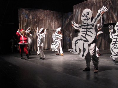
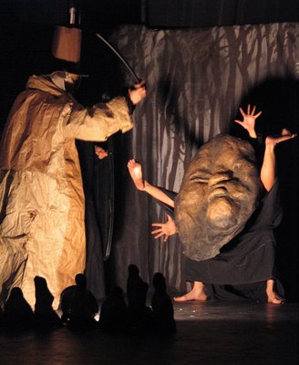
Here’s an excerpt from my preview of Bread and Puppet Theater’s "The Divine Reality Comedy," a reimagining of Dante’s "Commedia" for the “War on Terror” era, which the Vermont troupe is bringing to the Boston Center for the Arts next week:
Dante’s epic begins in Hell and ends in Heaven. Bread and Puppet’s version, on the other hand, begins in “paradise,” home to the troupe’s acid satire of the dehumanizing effects of capitalism in the US today — complete with Santa Claus as the demon god of consumerism. The action lightens briefly with a ballet for cardboard horses. Then the show descends into a purgatory and hell of indefinite detentions, interrogations, and torture. Narrators read US government accounts while puppets and masked actors re-enact the dark deeds.

“I see the cruelty of this society as coming directly from the wonderful philosophy of capitalism,” Peter Schumann, who founded the company in 1962, explains. “I’m saying the School of the Americas and Abu Ghraib and Guantánamo are not ‘rotten apples,’ as Bush called them, but are philosophically correct, pinpointable climaxes of the system, the cruelty of the capitalist system.”
You can read the rest of my essay here. It touches on Schumann’s paintings that have sparked charges of anti-Semitism. More on that here in the coming days.

Bread and Puppet Theater’s “The Divine Reality Comedy” for adults from Feb. 7 to 10, 2008. Also the kid-friendly The “Divine Reality Comedy Circus” on Feb. 9 and 10. And The University of Majd: The Story of a Palestinian Youth, an exhibit of seven large new paintings of his that will hang in the BCA Cyclorama February 4-10. All at the Boston Center for the Arts Cyclorama, 539 Tremont St., Boston.

Photos by Jonathan Slaff.

Tuesday, January 29, 2008

Rachelle Beaudoin’s controversial shorts


Rachelle Beaudoin, whose work made my best of 2007 list, recently ran into a bump when someone or someones objected to artwork she planned to show in “The Biennial Keene State College Art Faculty Exhibition" in Keene, New Hampshire, where she is an adjunct faculty member. Beaudoin, who resides in Peterborough, New Hampshire, tells me that she worried that because of the concerns raised the college might not let her exhibit her art at all.

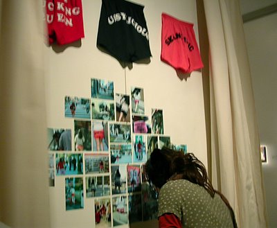
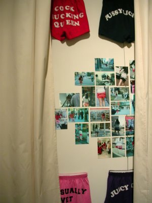
Beaudoin makes funny, rascally, smart, discomforting, potty-mouthed feminist conceptual art. The work in question is her “Cheer!Shorts,” which are sporty shorts with custom slogans printed across the butt like “Unusually Wet Pussy” and “Totally Waxed.” They critique the objectification and branding of women, of girls, as sexual commodities, and how they participate in it by wearing clothes with slogans like “Juicy” that imply what Beaudoin has put bluntly. The piece also includes photos of Beaudoin wandering Providence, Rhode Island, wearing the things. There’s one that’s particularly disconcerting because it shows her standing in line at some fast food joint in front of what appears to be a mother with two young boys. Beaudoin is wearing red shorts that say “Cock Sucking Queen.”

Beaudoin was inspired to make “Cheer!Shorts” when she was teaching art to seventh- to twelfth-graders in Gorham, New Hampshire, a few years ago. A girl came to school in a shirt featuring the Playboy bunny logo, and Beaudoin was troubled by it, and found it hard to get the student to understand what was troubling about it.

“There was no effort to stifle it,” Keene State spokeswoman Robin Dutcher says of Beaudoin’s work. Since whoever is objecting to Beaudoin’s work hasn’t spoken out publicly, it’s unclear exactly what the objection is. But the school became concerned that the work might be pornographic. And leaders were wary after complaints in 2006 about a student’s wire sculpture of a bound woman hanging from a noose that was hung in a public spot on campus. It was apparently about violence against women. The sculpture was eventually removed.

In this instance, Dutcher tells me, “The main thing was that viewers wouldn’t be caught unawares.”

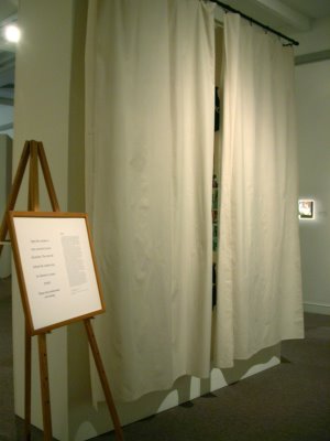
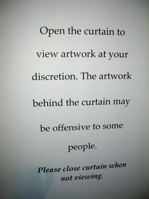
Keene State reached a compromise that let Beaudoin exhibit her art if she kept it behind a curtain and next to a warning sign (pictured here). “My first instinct was that it was funny to have a curtain,” Beaudoin says, “but when I got there I was kind of taken aback.”

“I want it to be out there,” Beaudoin says of her work. The curtain changed the work for her, though, took it out of her hands, changed its tone. And she feels disappointed that the person or people troubled by her work apparently didn’t understand the critique she is making, and didn’t get the joke she’s making. And she feels jarred by the controversy. “It’s always disturbing when something happens to your work that you’re not fully in control of.”

I think it’s a good sign that someone was troubled by Beaudoin’s work because it means that the art is reaching people. And because Beaudoin’s work is troubling. And it’s good that the powers that be found a way to let the show go on anyway. The school’s compromise seems reasonable, if awkward. And funny.

So often art feels as if it’s powerless and inconsequential. Most of the time art stays neatly in the art world, where we’re all trained to handle everything, no matter how consequential or disturbing, with stylish aplomb. But it’s sad when no one seems moved by troubling art. Those who would stifle or censor or shut down or cover up such art acknowledge its power.

The stuff in Beaudoin’s work that has troubled someone in Keene is likely the same stuff that troubles Beaudoin. And this is a good thing. And it’s good that it’s drawn attention to Beaudoin’s subject. I hope people aren’t just shocked and scandalized. Because Beaudoin is scratching at something important, and funny, and troubling about sex and women in our society by saying the words that are implied by this sort of clothing but rarely said outright.

“The Biennial Keene State College Art Faculty Exhibition,” Thorne-Sagendorph Art Gallery, Keene State College, Wyman Way off Main Street, Keene, N.H., Jan. 26 to March 9, 2008.

Monday, January 28, 2008

The 2008 “State of the Art in Boston” Address


My fellow art world citizens, once in a while we gather to consider the state of our city’s art scene. As we gather this year, I think of our Institute of Contemporary Art. When the ICA opened in its new South Boston building in December 2006, getting the building built was itself rightly seen as an enormous accomplishment. (Applause.) The building also stands a challenge, as a sign that people in town are raising the stakes of what should be expected from Boston art. In the little over a year since, the ICA has struggled to live up to the enormous hopes and expectations raised by their opening bid, but this year looks promising for the ICA, with retrospectives of Anish Kapoor and Tara Donovan planned. (Applause.) But how are the rest of us living up to the ICA’s challenge, its dare to raise the level of our game?

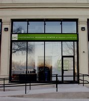
Boston offers two vital commercial gallery districts. And for a city this size, Boston has a wealth of institutional art infrastructure – the Harvard Art Museums, MIT’s List Visual Arts Center, Brandeis’s Rose Art Museum, Wellesley’s Davis Museum, the DeCordova Museum, Phillips Academy’s Addison Gallery, the Isabella Stewart Gardner Museum, MassArt, Montserrat College of Art, Salem’s Peabody Essex Museum, Boston University’s Photographic Resource Center (pictured at left), the Tufts University Art Gallery, Boston Center for the Arts, Boston College’s McMullen Museum, Framingham’s Danforth Museum. Art curating is one of Boston’s strong suits. Exhibitions put together here – for example the Peabody Essex’s Joseph Cornell retrospective, the Danforth’s Joan Snyder retrospective and the Addison’s William Wegman retrospective – receive national acclaim when they travel elsewhere. (Applause.)

Today, Boston is on the cusp of a major transformation of the institutional infrastructure available for exhibiting modern and contemporary art. The new ICA building is just one sign of this. As it comes to fruition, we should see heavyweight art institutions here addressing contemporary art in a way that they have not since, say, Impressionism. (Applause.)

Boston’s Museum of Fine Arts plans to open an expansion in 2010 that promises to have more space for late-20th century and contemporary art than the new Institute of Contemporary Art. The Isabella Stewart Gardner Museum, the Harvard Art Museums, DeCordova Museum, and Rose Art Museum are all planning renovations and/or expansions.

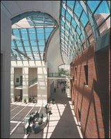
Last year’s stellar Cornell retrospective at the Peabody Essex Museum (at left) is one example of how a building project (the Peabody Essex completed a renovation and expansion in 2003) can help a museum change its profile, and reshape the local institutional playing field. (Applause.)

But how does locally-made art fit into this? While we need to import major work from elsewhere for our edification, inspiration and amusement (the Cameron Jamie survey at MIT’s List Visual Arts Center was a strong example last year), how can we do more to incubate and champion great art here? If we don’t pay attention to art made here who else will? The point is not just to boost the careers of local artists, but that by encouraging cool people and cool stuff here we foster a more lively, compelling, entertaining community for all of us who live here. (Applause.)

One of the disappointments of the last year was that the Indianapolis Museum of Art’s retrospective of Brookline’s Maria Magdalena Campos Pons, one of our most acclaimed local artists, didn’t come to any New England venue.

That said, the MFA has done an interesting job of representing locally-made art, both recent and historical. It presents locally-focused prize exhibitions (Traveling Scholars, Maud Morgan prize), significant solo showcases (Laura McPhee), and even blockbusters (Edward Hopper, “Americans in Paris”). The ICA has paid attention to locally-made art in its permanent collection and prize exhibits like the biannual Foster Prize show. Local artists could be better integrated into the ICA’s group shows and the “Momentum” exhibition series.

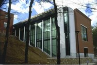
And then there’s the DeCordova Museum (pictured at left), which is dedicated to showcasing New England art. Now is a good moment to consider how it fulfills this mission as the institution is in the process of finding a new director to fill the shoes of Paul Master-Karnik, who resigned at the end of last June after some 22 years leading the museum. DeCordova has a good record of selecting one or two great local artists each year among those in its Annual Exhibition. On the whole, its exhibitions tend to (accurately) reflect New England art’s emphasis on craftsmanship, but too often with works that are more competent than inspiring. It should renew its commitment to new media art, where it had been a leader but has fallen off since the departure of curator George Fifield. And I hope that the inclusion of The Institute for Infinitely Small Things in this spring’s DeCordova Annual is a sign that the museum will pay more attention to the conceptual end of the local scene.

But any curator looking to emphasize local art is challenged by the continuing stuffiness and thinness of the Boston scene. It’s instructive to compare the Boston and Providence art scenes. Major excitement and surprises continually bubble up in Providence (“The Apartment at the Mall” and the Musée Patamécanique are but two recent examples) in a way that rarely happens in Boston. Instead in Boston we have the Mooninites corporate graffiti. And we have The Superheroes Project, which is an amusing goof, but note how it’s focused on developing publicity for art, rather than about making art, and involves borrowing existing ideas (superheroes), rather than inventing something new.

One of the reasons to look at Providence is that it demonstrates that new, exciting art can come from small places. It’s worth remembering that most major art movements begin as small groups of friends. Cubism, one of the most influential ideas of the past century, began with just two or three guys.

Of course, Providence has a significant advantage with RISD, one of the major art schools in the nation, and a magnet for artistic talent that Boston can’t equal. (Harvard and MIT are major magnets for talent in pretty much everything but art). Providence also has the nonprofit art center AS220, a major incubator of young artists, including the folks who formed Fort Thunder, the Hive Archive, Dirt Palace and the Musée Patamécanique. Some argue that, at least before Sept. 11 and the 2003 Station nightclub fire, Providence offered more affordable spaces and less official oversight (police, permitting, etc.) than Boston, which helped to foster art there. But, I think, the major difference between the two cities is that in some fundamental way Boston’s art scene is about fitting into existing institutions and projects, while Providence’s art scene is about developing your own thing. Boston needs more DIY spirit.

Some exciting art is percolating here. One group to watch is the iKatun and Institute for Infinitely Small Things gang (pictured at left). Their “Initiative for the Renaming of Names in Cambridge” and “The New American Dictionary: Interactive Security/Fear Edition” represent some of the smartest, funniest, most incisive art coming out of Boston. And they’re beginning to gain notice elsewhere. Beyond their politically-tinged brand of neo-Fluxus art, they’ve also organized, with artist Jane Marsching, public forums on race in Boston and the idea of the commons that have injected big ideas into the local discussion. (Applause.)

Also keep an eye on Boston’s new media art. The city stands out as one of the best places in the country for new media infrastructure with Axiom gallery, the Boston Cyberarts Festival, Art Interactive gallery, the Collision Collective and the journal Aspect. RISD recently named MIT new media artist and guru John Maeda to be its next president. Highlights of local work from the past year include Denise Marika’s video and braille installation at Axiom, Cliff Evans’s video installation at the Gardner Museum (Evans went to school in Boston and now teaches here, though he’s based in Brooklyn), and Andrew Mowbray’s video and props installation at Space Other. Much other locally-made new media work is promising, but still feels like it’s in a fledgling, testing phase.

I find myself in a (Clement) Greenbergian frame of mind regarding new media art – I’m most fascinated by works that take advantage of the specific properties of the new media to embody their content. That’s the promise I see in Bostonian Brian Knep’s computer and video projections, which use the computer’s knack for producing special effects and endless variations within set parameters to create distinctly digital art about natural systems, healing and aging.

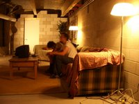
Promising art is also sprouting in Somerville. Folks there have been putting on cool creative festivals, from dancing and sculpture under the McGrath Highway overpass, to the Fluff Festival and Artbeat, to the Honk Fest. The Nave Gallery organized an exhibit of catch-as-catch-can work by the city’s “art gangs” this summer. Some of these artists have begun to cross over into the rest of the gallery scene, in particular with shows at Rhys Gallery. The wild assemblages of Elaine Bay (pictured at left), a member of the Miracle 5 collective, deserve special attention. Much of this Somerville stuff is still under development and messy, but it’s exciting to see its crackling rascally underground energy. (Applause.)

Sunday, January 27, 2008

Vagina dentata


In this week’s Boston Phoenix, prompted by the new film “Teeth,” I wrote about the history of the vagina dentata:
If there’s one thing the new horror flick “Teeth” teaches us, it’s that nothing sours a romantic soirée like a vagina dentata. The phrase — Latin for “vagina with teeth” — conjures men’s primal fear of sex, the opposite sex, the word “vajayjay,” and dentistry.

The term seems to have come into use in the early 20th century, around the time Sigmund Freud was dreaming up his theories about castration complexes. But the idea has roots in numerous ancient cultures. There are Native American tales like the Ponca-Otoe story in which Coyote spends a night snuggled between the sexy daughters of an evil old witch. One girl warns him that they have lethal jaws in their private parts. So Coyote kills the other girl and the witch. Then, according to Richard Erdoes & Alfonso Ortiz’s 1984 book “American Indian Myths and Legends,” he bashes out his gal pal’s vaginal grill “except for one blunt tooth that was very thrilling when making love.”

A sign of the tale’s power is that it persists in modern times. Vietnam vets returned home with urban legends warning of Vietcong prostitutes hiding broken glass and razor blades in their vaginas.

“Teeth” writer and director Mitchell Lichtenstein (son of the late pop artist Roy Lichtenstein) has said that he first heard of the “vagina dentata” in the ’70s, in a college class taught by feminist social critic Camille Paglia. Tuition dollars well spent. These days, it’s used mostly to describe art: an abstracted naked lady with a praying-mantis face in Pablo Picasso’s 1930 painting “Seated Bather”; the monster grins of human-dinosaur mutants in Francis Bacon’s 1944 painting “Three Studies for Figures at the Base of a Crucifixion”; the menacing smiles on the jagged faces of women in Willem de Kooning’s 1950s Abstract Expressionist paintings. It’s also been applied to the fanged space bugs that menace moist tunnels in the “Alien” films.

But these examples describe mouths, not vaginas. (I’m not sure how the Aliens’ bity penis-like tongues fit in.) Actual appearances of vaginas plus teeth in art, literature, and pop culture are few and far between.
Read the rest here.

Related: Later in the essay I mention how Lee Bontecou made rugged steel and canvas wall reliefs in the ‘60s that had vents or orifices or black holes that were sometimes filled with what look like saw blade teeth. Brown University’s Bell Gallery has an awesome example up right now in its exhibit “Women’s Work.”

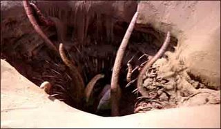
Pictured: The sarlacc in “Return of the Jedi.”

“Some Sort of Uncertainty” at Axiom


“Some Sort of Uncertainty” at Axiom Gallery, as I wrote in my review,
makes the gallery appear empty, but that’s a tease. Eight artists brought together by guest curator Adriana Ross have hidden stuff all over the place, and they’ve provided a map and a list to create a scavenger hunt. ….

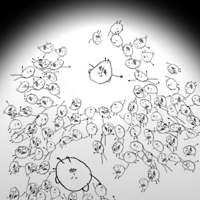
It’s worth the trip to see what Cantabrigian Brian Knep is up to. Peek around a corner into a little inaccessible room and you’ll see a dim circle of light projected on the wall opposite. Flip a nearby switch and an oval of brighter light shines on the wall. Cell-like things (actually a child’s drawings of balloon-head people with stick limbs) swarm to the top of the oval, leaving a gap where the dim circle of light had been. Now and again, one of the cell people enters the circle, inflates, and sinks to the bottom. Then the bright light goes out and the critters drift down, until you switch the light back on and the cycle begins again. Knep’s interactive video installation is a digital cross between watching sea monkeys and playing those ’80s Tomy water pinball games.

Artwork by artwork, Knep has been developing computer programs that produce ever more complex action and dazzling special effects. I’m looking forward to seeing all the incremental advances coalesce into something awesome — here the cycle of action is too simple to sustain significant contemplation. Perhaps if Knep puts a few of these together (a variation of this piece was exhibited at Gasp in 2006), the cumulative effect will be meatier. Or maybe some additional incidents could complicate the action, making it less an equation and more a developing narrative.
“Some Sort of Uncertainty,” Axiom, 141 Green St., Jamaica Plain, Jan. 11 to Feb. 17, 2008.

Pictured: Brian Knep’s “Expand” 2008.