Thursday, June 19, 2008

Exhibit from closed URI galleries going to RIC?

It looks like an art exhibit that would have been the fall opener at the University of Rhode Island Fine Arts Center Galleries, before it was announced early this month that the program would be shut down, will instead be presented at Rhode Island College’s Bannister Gallery in Providence.

“It appears now that RIC is going to support the exhibit that was going to be there in September,” interim Bannister Gallery director James Montford said today.

The show, organized by laid-off URI galleries director Judith Tolnick Champa, is a selection of paintings and collages by Arnold Mesches of Gainesville, Florida. Montford said RIC faculty who would have been featured in the Bannister’s annual faculty art show in September have given up their slot to support Tolnick Champa and the URI show.

RIC’s Bannister Gallery to expand?

Rhode Island College’s Bannister Gallery in Providence could expand its exhibition space over the next year, interim gallery director James Montford said.

Montford’s office had been located in the gallery, but he recently moved into digs down the hall. He said he plans to turn his old office into a small spotlight gallery to augment to college’s main gallery.

Federal Hill gallery district?

A mini gallery district is sprouting on Providence’s Federal Hill, with three galleries moving onto Atwells Avenue, all within a few blocks of Gallery Z.

The new Federal Hill galleries will include the Gallery at 17 Peck, which moved there last week from its namesake location in Providence’s financial district, Royal Gallery and Chabot Art Gallery.

Read my full report here.

Walker Gallery to be at 38 Newbury St.

Stephanie Walker, former director of Chase Gallery on Boston’s Newbury Street, plans to open her own gallery, Walker Contemporary, at 38 Newbury St., on Sept. 6. The gallery will be on the seventh floor of the building, next to Alpha Gallery.

Newbury Street is expected to lose three galleries before the summer is over. Yezerski is moving to Harrison Avenue, and Pepper and Goldman are closing, at least for now. Two other Newbury Street galleries are planning moves – Miller Block into the spot at 38 Newbury St. where Pepper was, and Urdang is looking for a new location on Newbury Street.

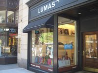
But by fall, three new Newbury Street galleries are expected to be operating. Lumas Editions Gallery opened at 141B Newbury St. last weekend. Galleria Florentia plans to open at 79 Newbury St. on June 27. And then there’s Walker.

Walker has spent a year in Los Angeles, but plans to return to Boston by early July. The inaugural exhibition, she writes, will feature gallery artists Jennifer Davis, John Dempcy, Susan Dory, Elisa Johns, Jae Ko, Nancy Monk, Dharma Strasser MacColl, Don Maynard, Whitney River, Michael Schultheis and Anne Siems. She plans to present monthly solo exhibitions in a main gallery, plus new work by gallery artists in a secondary room.

Tuesday, June 17, 2008

Lumas opens on Newbury Street

Lumas galleries opened a Lumas Editions Gallery at 141B Newbury St. in Boston on June 14.

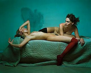
Lumas specializes in limited-edition photographs, but also offers other art and design. Artists include David Armstrong, Alex MacLean, Zaha Hadid, Nan Goldin, Edward Steichen, and Swiss photographer Michel Comte, whose “Rizzoli Nudes” is pictured below.

Since 2004, Lumas has opened branches in New York, Zurich, Berlin, Duesseldorf, Frankfurt, Hamburg, Cologne, Munich and Stuttgart.

Public art on Radio Boston

Radio Boston’s May 27 program “Public Art” sounded an alarm about “the privation of public art” in Boston. Its main point was summarized by Ricardo Barreto, director of the UrbanArts Institute at MassArt: “The politicians need really to see that there’s a void in Boston. And other cities are filling it and we are not. And there are economic implications. The other cities that are filling the void are joining the 21st century, and if we don’t’ fill that void we will be stuck somewhere else.”

Perhaps.

The Boston area actually is rich in public art – but in keeping with our area’s historical bent, much of it is old. We do have two significant contemporary sculpture parks: UMass Boston’s “Arts on the Point” (a mixed bag, but it has Mark Di Suvero's great “Heru’) and the DeCordova Museum and Sculpture Park in Lincoln. (Although, I'm not quite sure if DeCordova counts as public.) And we do continue to produce major, quality public artworks, like the New England Holocaust Memorial, which was dedicated in 1995, in downtown Boston, near Faneuil Hall, on the Freedom Trail.

But assuming we might be failing to join the 21st century with public art, I’m not sure that any of the people on the program are the right folks to lead us there (here?). The program was too focused on the art of public art and not enough on the public. So the show’s brand of public art seemed, like most art, to be about stuff for a relatively small, elite audience of white people – but colonizing public spaces.

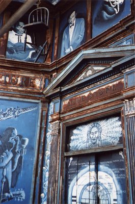
This was apparent in the program’s focus on downtown Boston and Cambridge, with the rest of the area basically ignored. The show noted that local public sculpture is dominated by old dead white guys in metal, but after raising this issue of race and gender, it did little to examine how public art addresses these communities. It ignored all the murals in Roxbury – like the murals depicting musicians on Ferdinand’s Blue Store in Dudley Square (pictured above), the Negro League stars mural at the corner of Stoughton Street and Columbia Road in Uphams Corner, and the “Faces of Dudley” mural (including Malcolm X) in Dudley Square. These murals show that a major benefit of public art is that it frequently addresses subjects that are mostly off the radar of the art world – in this case the history and accomplishments of African Americans, and in particular Roxbury residents. Augustus Saint-Gaudens’ 1897 “Memorial to Robert Gould Shaw and the Massachusetts Fifty-fourth Regiment” at Boston Common is another example of this.

While I support public art in general, we can’t overlook that most art ain’t that great – and public art is no exception. The difference is that public art occupies public spaces, and tends to be on display longer than most art. So it deserves caution. Perhaps we should review public art every 15 to 20 years to see if it still deserves its public spot. Perhaps with neighborhood (i.e. public) referendums.

During the radio program, Barreto made the common mistake of using the term “art” to describe the quality of something, rather than a type of thing: “You have to really wonder with something like this how much of this is really art and how much of this is sort of craft and kind of a social, cultural manifestation at a different level. Which doesn’t mean it’s bad, it just means it’s different.”

This is a retrograde, 19th century idea of what art can be. Since Marcel Duchamp “discovered” the ready-made in 1915, the definition of art has happily expanded to include nearly everything – and then we decide how successful that art is. If we’re really concerned with “joining the 21st century,” we need to approach public art with this more inclusive criteria in mind.

When it comes to public art, aesthetic and intellectual enrichment is just one of the factors we should consider when deciding whether a piece is successful – and it may not ultimately be the most important one. Other criteria that should be addressed: does it provide entertainment, embody the nature of its location, become a landmark, become an icon representing its location, become embraced by the community?

One of the most successful pieces of public art in the region is Gloucester’s Fisherman’s Memorial. The sculpture itself is okay – a traditional realist monument depicting a fisherman at a ship’s wheel facing out to sea, with the inscription “They that go down to the sea in ships, 1623-1923.” But it directs our gaze out to sea, we are on the ship with the man. It has come to serve as a place of public remembrance – where lives lost at sea are recalled, and annual community memorial events are held. Tourists come just to see it. And it has become a landmark and a symbol, an icon or logo of Gloucester.
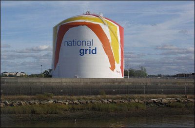


Boston’s most prominent piece of public art is Sister Corita Kent’s rainbow-striped gas tank off Route 93 in Dorchester (pictured above). It’s kind of cheesy, but it brightens its location, and has become a landmark.

Come to think of it, an even more notable landmark piece of Boston public art is the Citgo advertising sign in Kenmore Square (which looks like a light-up ‘60s Frank Stella). It may not have originally been public art, but it became some sort of mutant advertising-pop art hybrid after community (i.e. public) opposition stopped the oil company from demolishing it in 1983.

How do we foster more of this sort of public art? And even better quality pieces?

Radio Boston harped on government funding for public art. But funding is just as much the artists’ responsibility. Part of being a successful public artist is navigating the logistics – political, community, financial, construction – required to make the work happen.

Artists can’t just wait for government handouts. It’s worth noting that Kent’s rainbow mural is on private property and was funded by the private owner (Boston Gas, now Keyspan). And the Citgo sign is/was a corporate advertisement. This is not simply about public funding. Note that Boston’s Museum of Fine Arts just secured private funding to acquire those crappy giant bronze baby heads by Antonio Lopez Garcia that have recently served as hood ornaments for the museum.

[Also note that though Anish Kapoor’s masterpiece public sculpture “Cloud Gate” is in a public park in downtown Chicago, it took significant private funding to get it built. And I recall that the mayor there used this private funding as a way to skirt much public oversight – which may not be how we want to go. And it required immediate repairs, which nearly doubled its budget. But, man, is it a success now.]

And if we’re concerned about public art it’s probably not helpful to focus too much on the success – or lack thereof – of individual artists. Radio Boston placed a major focus on the plight of Mags Harries of Cambridge. During the program, former Boston Globe critic Christine Temin said Harries had given up applying to do public art in Boston because she’d been rejected so many times. In fact, Harries may have more public art on view here than any other artist. Her permanent (or at least long-term) local art projects for government entities include: “Asaroton [Unswept Floor]” (1976) for Boston’s Haymarket; a 1983 gateway inside Cambridge’s Longfellow Elementary School; “Glove Cycle” (1984) for the MBTA’s Porter Square station in Cambridge; “Ben’s Circular Tower” (1994) in Mission Hill for the city of Boston with funding from the city’s Browne Fund; and “Drawn to Water” (1997-2002) at Cambridge’s Water Treatment Plant.

Perhaps the real question with Harries is whether other local artists need to be given a chance.

Like all art, the state of public art here depends on a combo of creativity, encouragement and serendipity. Boston still struggles with finding its way as a creative community. On this subject, it’s worth re-reading AS220’s 2004 essay “Compost and the Arts: How to keep the arts from dying of old age.” It argues that to foster creative communities we need to support inexpensive artist live-work spaces, shared work spaces, places to display posters to share information, and places for the art community to hangout and trade ideas. “The result of policies like this will be ferment,” the paper argues. “Not all of what grows out of it will be great art, but experience shows that with enough ferment, some will.”

Determined artists find ways of making things happen – like Matthew Hincman, with his guerilla art park bench that he snuck into Jamaica Pond, and Providence’s Apartment at the Mall gang.

Major art movements have often begun with small groups of people – the cubists began with just two or three guys; abstract expressionism originated among about a dozen people. Improving public art here may just come down to getting a few interesting, motivated people in the right places – art world, financing, or government. Or maybe just one well-placed person.

Monday, June 16, 2008

Richard Serra speaks at Williams graduation


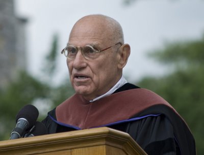
New York sculptor Richard Serra spoke at Williams College’s 2008 commencement on June 1. Here is an excerpt from his speech:
“It’s only your own individual perception that’s going to give reality a meaning. If you don’t make the case for yourself, no one else will. Value your private sensations and sentiments but beware of the distortions by analogy and metaphor. The constant need for referents prevents direct experience. Experience does not always need to be compared and related. The habit of recalling stored imagery subverts both what’s present and what’s being re-called. Analogies and metaphors fail to impress a solid image on us. I have no problem with the virtual reality on your screens as long as you are aware that it is virtual. My concern is that experience by proxy is a poor substitute for the reality of the interactive space we inhabit. As a sculptor I believe that perception structures thought and that to see is to think and conversely to think is to see. The virtual reality of the media, be it television or internet, limits our perception in that it affects our sense of space. It immobilizes our ability to apprehend actual physical space. Don’t let the rhetoric of simulation steal away the immediacy of your experience. Keep it real, keep it in the moment.”
Read the full speech here.

Related
Links to 2008 graduation speeches by J.K. Rowling at Harvard, MTV President Doug Herzog at Emmerson College (pdf), 2006 Nobel Peace Prize winner Muhammad Yunis at MIT, Red Sox President and CEO Lawrence Lucchino at Boston University, and Laurie Anderson at RISD.

Photo by Nicholas Whitman.

Sunday, June 15, 2008

Did Kapoor installation reveal ICA building flaw?


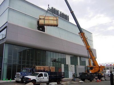
When I heard that Boston’s Institute of Contemporary Art had to cut hole in its facade to bring in one of largest sculptures in its Anish Kapoor exhibition, it struck me as odd. Why did a year-and-a-half-old art museum have to be ripped apart to bring in art? ICA spokesperson Colette Randall tells me: “This was the most time-effective and straightforward way to bring ‘S-Curve’ in.” [I’ve posted her entire explanation at bottom.] There’s something wrong with the design of a museum – custom built from scratch – when the most efficient way to use it requires you to cut a hole in the front wall.

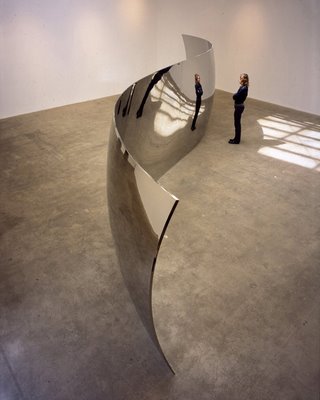
The problem, Randall explains, is that the two crates holding Kapoor’s 2006 sculpture “S-Curve” (pictured below), which is roughly 32-feet-long and 8-feet-tall when installed, wouldn’t fit into the ICA’s elevator to bring them up to the top-floor galleries. [See photos of the installation here and here.]

It’s not so unusual for a museum to make changes to its building to accommodate large projects. Mass MoCA built a new bay door to bring in the largest pieces of Christoph Buchel’s (failed) installation last year. A difference, though, is that Mass MoCA is located in old factory buildings converted to museum use, while New York architects Diller Scofidio + Renfro designed the ICA from the ground up specifically for exhibiting art.

I can’t help seeing the ICA-Kapoor problem as a lack of foresight. ICA curator Nicholas Baume said at the Kapoor exhibition’s press preview that the show had been planned for five years, and was specifically developed with the new building’s galleries in mind.

But even if Kapoor wasn’t on the schedule, the architects had to be aware that contemporary art at the top level that the ICA aims to work at is often supersized. One of the Mark Bradford collages in the museum’s current “Street Level” show is 20 feet wide. (I assume it rolls up.)

According to the ICA, “S-Curve” is shipped in sections in two 8’ 2”-tall, 4’-wide and 16’ 9”-long crates; unfortunately the ICA’s elevator is 9'11" tall, 9’ deep and 16’ 6” long. Ugh. It’s so close to fitting that I don’t expect this to be a frequent problem – and one that hopefully is resolved since, Randall says, the cut in the facade will serve as permanent doors. But it’s a problem that the architects and ICA planners should have been able to head off.


Related:
ICA spokesperson Colette Randall explains:
We were pleased that we had a way of getting such an important piece into the museum. It is probably not a coincidence that few museums have exhibited so many of Kapoor's work in one room. Installation of his works does present a challenge! And we are thrilled to have made it possible (as far as we know, the ICA is the only museum to show this many of his monumental works at one time in this country).

“S-Curve” could not fit into the elevator, so we created a new door on the southwest side of the building (the back wall of the West Gallery) and craned the work in. This door will be used in future when the need arises.

Two other works were brought in through the new door, though they would have fit through the elevator. Since we were installing “S-Curve” that day, we decided to bring all three works in by the same method.

This was the most time-effective and straightforward way to bring “S-Curve” in. We considered all viable options, most notably an internal hoisting system included in the architects' original design, but this method of installation would have taken us longer and would have been more disruptive to the daily functioning of the museum. Due to the weight of the object we felt it was safer for both the art handlers and the work itself to use the crane.

Galleria Florentia coming to Newbury Street

Galleria Florentia, a new Boston gallery, plans to open on June 27 in a basement and street level space at 79 Newbury St. and offer paintings, sculptures and furnishings.

The gallery describes itself as “the premier source of original, museum quality art, handcrafted by respected European artisans, working with centuries-old traditions.”

Boston Business Journal reports that it will be run by sisters Pamela and Pari Yassini.

Anish Kapoor interview


I spoke with Anish Kapoor at his exhibition “Anish Kapoor: Past, Present, Future” at Boston’s Institute of Contemporary Art on May 27, 2008. Below are excerpts from that interview:
  • “Art at one level is effect. And art is illusion. So I’ve always believed that the illusionistic in a way is allowed. Now in the age of Disney we have a certain association with the notion that anything illusionistic is also trivial. And I suspect that the true and deeper illusions are not trivial at all, they’re very profound.

    “At a simple level let’s take a work like ‘Iris,’ which is for me it’s a recessed concave mirror. For me it’s not a mirrored object or the illusion that it gives of upsidedownness or whatever. For me it’s a space full of mirror. And that does something quite different from any mirror that you’ve ever looked at. It’s a space full of mirror. There’s something ethereal about it. There’s something not quite real about it. There’s a kind of virtualness to it. I think it’s a new kind of space. It’s a new proposition, a new idea about the way space is affected, about the status of an object. It’s not quite there. And that’s why I’m interested in it.

    “’S-Curve’ does something in a way quite similar. At one level, yes, it’s a fun house mirror, it turns you upside-down and so on. But as an object in the space it has a kind of uncertainty let’s say about its own status. Is there dignity in that? Where does that bring us? I think that brings us to all sorts of places. Some of which are performative, cinematic. Some of which tell us, maybe, that it’s the skin of an object that describes its conditions in the world. That those last few microns on the surface apparently reveal what’s inside, but in actually probably don’t. So there’s a whole lot of kind of discourse for me anyway about the status of an object and it’s various projected realities."

  • “One wants to have as many fugitive meanings as possible. Why not? Because in the end all seriousness can be pitched in different ways. Perhaps there’s intellectually no problem with it tying itself to various kinds of, whether its sci-fi, popular culture, these kinds of fugitive meanings. Why not? … It’s the same thing that’s being talked about. There’s a history in this kind of mystical language of whether we go from cabalistic imagery to, I don’t know, Aleister Crowley and those dark magic images to science fiction. There’s a very easily traceable line. I suppose it does tell us about some yearning that we have in different aspects of culture to step beyond the banality of the everyday. And that there are certain phenomenon – light and darkness, apparition, disappearing, half-revealed, etcetera – that are phenomena that we see in the world, recognize in the world and that are applied to all of these things across the board, that reemerge across the board. In a way I have a feeling that the modern, as opposed to the post-modern, the modern now, this modern, this ultra-modern somehow needs to reengage with some of that stuff."

  • “The minimalists, of course, were very, very concerned with the idea that ‘What you saw was what you saw.’ That’s it, it’s there, nothing else. Now, I’m afraid I don’t believe that. I’m afraid I believe that what you see isn’t what you see. It’s never what you see. It never was what you see.”

  • “I think we learned two or three things [from that]. One of them is that there’s no such thing as abstract art, which I quite like. And that our ability to project meaning, our need to project meaning is so all encompassing that we do it given just the smallest amount of information. And that as an artist one can direct that need for meaning. I think that’s one of the things I’m really engaged in.”

  • “I’m really interested in two or three things. One of them is I want to make things that have a kind of attraction-repulsion sense in them. But I don’t want to state that too obviously. I don’t feel I want to make props for a movie. So that sense when you look at something it’s almost as if I’ve got somewhere like that in my body, or rather I’ve seen it somewhere else. That sense of a kind of recognition which can both be compelling and the opposite.

    “Much of the imagery, many of the forms I’ve worked with over the years are very sexual. Let’s say that the modernist tradition in form – which is only one way of speaking about it, but why not – is mostly phallic, mostly upward and onward, and it leads to the rocket and the spaceship. I have a feeling that the truly modern, meaning modern of today, the ultra-modern form is inside-out. And I’m trying to look for it. I try to look for inside-out forms. If one could say there’s a shape to the Internet, I’d say it was inside-out. Or rather involuting. That’s one way of talking about something.

    “Now, I like the idea that there’s a kind of little space on the inside of your armpit that has a – I know it, you know it, we all know it, it’s there as something, it’s a basic, it’s a kind of hollow that we instantly recognize. I want to get there, I want to get to that. Sometimes it’s an asshole, sometimes it’s vaginal. And I think that’s okay. That’s part of this, if you like, adventure. So the anthropomorphizing of the idea of an involuted form is something I’m engaged with.”

  • “There was representation. Then there was – and I’m really horribly paraphrasing, but anyway – then there’s cubism, meaning the world is broken into bits, the world is sort of taken apart. Then one has to say there’s the reassembling of wholeness – Brancusi and etcetera. I propose that the next new form is upside-down, inside-out, turning itself, only partially revealing itself. Now necessarily that is dark, sexual, underground and what Freud called the uncanny. It’s necessary, it’s part of the process. Phallic form seems to me to say onwards, upwards, we’re looking to the light, we’re looking outward. And involuted form seems to say – you know to use a Platonic metaphor – we’re not looking from the cave out to that light, which is marvelous. We’re actually looking at the back of the cave, over there, to where it’s dark and dirty and dangerous and smelly and sexual and, you know, half-revealed. And I think that’s the way it should be. Oh, God, it’s much more mysterious back there than all that [in the light]. That’s an idea about progress, about onward and upward. Look where it’s got us. Back there I think is true mystery, is true human profundity, it’s where we come from and it’s probably where we go.”


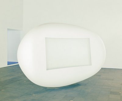
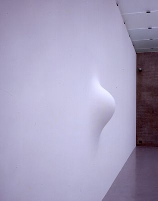
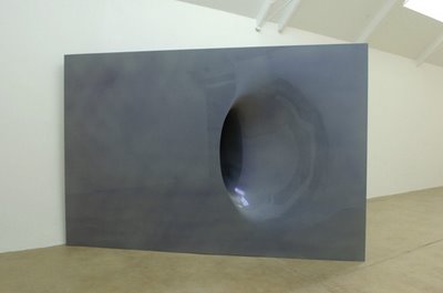
Pictured from top to bottom: Anish Kapoor, Untitled, 1998, and “Inwendig Volle Figur,” 2006.

Anish Kapoor


From my review of “Anish Kapoor: Past, Present, Future” at Boston’s Institute of Contemporary Art:
Over the winter, I made my third or fourth pilgrimage to Anish Kapoor’s “Cloud Gate” in Chicago. People there have affectionately nicknamed it the “Bean” because it resembles a giant floating bean of liquid mercury that’s drifted down into the middle of the downtown plaza from outer space. Bemused crowds stand around and stare and snap photos and giggle.

The 2004 sculpture is Kapoor’s masterpiece, and one of the best public sculptures in the country. It’s a metaphorical gateway arch to the city, tall enough for crowds of people to walk under. Like the best public art, it identifies and then embodies the meaning of its location — in this case a park that showcases the city’s skyline to one side and its lake shore on the other. The sculpture’s polished steel surface mirrors and frames and swallows these vistas, and the people standing around it, like, as a friend says, a giant snow globe turned inside out. The roof inside is concave and operates like a funhouse mirror, warping the reflections of the people underneath and seeming to funnel up into some portal to another dimension.

“The modernist tradition in form is mostly phallic, mostly upward and onward, and it leads to the rocket and the spaceship,” the London artist told me at the Institute of Contemporary Art last week, where “Anish Kapoor: Past, Present, Future,” which is billed as his first major US survey in 15 years, opened on Friday. “I have a feeling that the truly modern — meaning modern of today — the ultramodern form is inside out. And I’m trying to look for it. I try to look for inside-out forms. If one could say there’s a shape to the Internet, I’d say it was inside out. Or rather, involuting.”
Read the rest here.

Coming soon:
My interview with Anish Kapoor.

“Anish Kapoor: Past, Present, Future,” Institute of Contemporary Art, 100 Northern Ave., Boston, May 30 to Sept. 7, 2008.


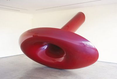
Pictured from top to bottom: Anish Kapoor, “When I Am Pregnant,” 1992, and “Marsupial,” 2006.

Zhang Daqian

From my review of “Zhang Daqian: Painter, Collector, Forger” at Boston’s Museum of Fine Arts:
While surveying the Museum of Fine Arts’ collection of Chinese paintings over the past few years, staff members came upon an ink painting of a majestic knotty mountain with people lounging and fishing at pavilions in a misty river valley at its foot. It was a sublime scene, even though the seven-foot-tall painting was cracked, threadbare in places, patched in others, and dulled by a gray-brown murk. Attributed to the 10th-century artist Guan Tong, the painting was acquired by the MFA in 1957, and it was hailed as a landmark addition to the museum’s collection. But over the years it quietly slipped into obscurity.

That obscurity was one sign that something wasn’t quite right. Neither MFA Chinese art curator Hao Sheng nor research fellow Joe Scheier-Dolberg, both of whom began working at the museum about three years ago, were familiar with the piece, “Drinking and singing at the foot of a precipitous mountain” [pictured above], when they pulled it out of storage. “A painting of this caliber,” Scheier-Dolberg tells me, “so early and so important, we certainly would have known about it.”

Seals indicated that the painting came from the collection of the 12th-century emperor Huizong. A colophon (a collector’s praise) written at the top purported to be by Zhao Mengfu (1254–1322), said to be the most accomplished calligrapher of his day. These eminent affiliations threatened to be too good to be true. The style seemed off. And most suspicious of all, the painting had come from the collection of Zhang Daqian.
Read the rest here.

“Zhang Daqian: Painter, Collector, Forger,” Museum of Fine Arts, 465 Huntington Ave., Boston, Dec. 15, 2007, to Sept. 14, 2008.

Climate change parade postponed due to weather

Platform2’s “Parade for the Future,” which was scheduled to be held at 4 p.m. today in downtown Boston, has been postponed due to the rain. The group says, “future date to be announced.”

Political buttons project at Miller Block

Ellen Miller of Miller Block Gallery in Boston is inviting local artists to design and decorate politically-themed buttons to be shown in “Campaign Buttons 2008: Artists Speak Out,” scheduled to be the gallery’s first exhibit when it moves into its new space at 38 Newbury St. in September.

“In an effort to foster a dialogue between art and politics,” Miller writes, “I will be distributing blank campaign buttons to a wide range of Boston based artists in the hopes that they will visually explore the impact of political alliance and support. The buttons will be 3 inches in diameter, large enough to allow for elaborate pictorial or verbal messages concerning the candidates, the issues and the future!”

Artists wishing to participate are encouraged to contact the gallery. Miller is kicking off the project with an evening of “beer, wine and munchies” from 6 to 8 p.m. Wednesday, June 18, at the gallery’s current third-floor location at 14 Newbury St. to give a chance for people to pick up blank buttons, and just get together.

The buttons exhibit is scheduled for Sept. 5 to Oct. 11. Miller explains, “The Campaign Buttons 2008 will be for sale, at a standard price of $100(most likely). A percentage of the sales will go to benefit the Artists Foundation, the artist and the gallery will split the remainder of the profit, or unless otherwise determined on an individual basis.”